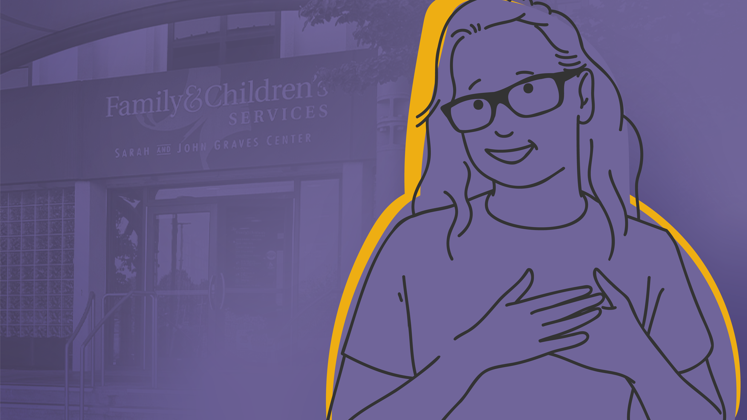
Bringing a client’s voice to life
FCS needed a strong kickoff for their fall fundraising campaign. Centered on a former client’s voicemail, we brought the main video to life by blending animation with a grounded on-camera story from the staff member who knew it best.
I was responsible for shaping the concept, illustration, animation, and project management while also co-directing and running camera on shoot day. It was a small project with a big emotional core that reminded everyone how powerful a simple, well-told story can be.
Giddy Up and Give for United Way
Each year, Family & Children’s Services rallies internal support for United Way and this time, we went full rodeo. The short film follows a wandering toy pony who finds belonging (and purpose) at a western-themed pep rally, wrapping a heartfelt message in tongue-in-cheek cinematic flair.
I co-led creative direction, supporting concept development, visual approach, and camera. The production was quick-turn but high-concept. It’s the kind of playful storytelling that reminds everyone that nonprofits can (and should) have fun.
A brand refresh for a non-profit podcast
OK State of Mind started with a distinctive look that was disconnected from the Family & Children’s Services’ parent brand. The show’s branding had a lot of personality, but not a lot of structure. It was built for an audio-only podcast, and once video entered the picture, the brand started working against the production instead of with it. The logo struggled, the typeface subverted the show’s tone, and nothing quite held up across motion or social.
From ribbon-cutting to reality
When Family & Children’s Services opened its new North Tulsa location, we documented the milestone with a ribbon-cutting video that doubled as both celebration and awareness tool. I ran camera, capturing speeches, community energy, and the first tours through the building. The video served as both documentation and timely promotion, extending the excitement of the event until the full spotlight piece was ready.
This video digs deeper into the story behind the new North Tulsa building, why it matters for the community, and what it means to the staff who serve there. I led creative direction, shaping the concept, storyboards, and visual tone to align with FCS’s broader spotlight series. Consistent branding and heartfelt storytelling helped position the building as a symbol of access, pride, and regional impact.
Retro energy, modern production
For 2025’s The Party: Just Wear White, we leaned into the Studio 54 theme with a lo-fi, vintage aesthetic. Think blown-out, on-camera lights and smeared motion. The result was a recap that felt authentically retro without leaning too hard on nostalgia tropes. My role focused on concept, direction, and production — guiding the look, setting, and camera approach that brought the 1970s vibe to life.
More than a recap video
Event recaps can start to feel the same after a while—so for Family & Children’s Services’ annual Brainiac Ball, we built in a creative twist to keep things fresh. The concept gave us a loose structure to shoot within, making the process more playful while still serving the bigger goal: creating a sense of energy (and FOMO) that fuels future giving.
I co-produced the project with another multimedia manager, leading concept, art direction, and camera during production. We also developed a series of short interstitials that played throughout the night—keeping the show moving and the audience engaged.
Hope starts with a repeatable format
These videos showcase Family & Children’s Services East location, making the building approachable and familiar for the community. I handled creative direction, pre-production, and camera work, balancing polished visuals with an inviting, friendly tone.
This project’s success established it as a new, repeatable “building spotlight” format.
Bringing trust and identity to a new kind of health resource in Tulsa
Connect is a free support program aimed at closing Tulsa’s life expectancy gap by reducing disease and health disparities—specifically among qualifying residents of North Tulsa. Built around deeply personalized care plans, Connect needed more than just a name; it needed a brand identity that could break through skepticism and build real trust.
Building a bold brand for a disruptive cannabis lab
Abraxas Labs is a small but driven cannabis testing startup with one goal: raise the bar for scientific integrity in their industry. While their team of PhD-led scientists had the passion and expertise, their early marketing efforts were scattered and unfocused. That’s where I came in—to help them find their voice, define their position, and create a game plan that would cut through a noisy, lookalike market.
What is a logo Easter egg?
Using the UK Office to show how abstracting something about a business can create something unique and easily recognizable.
It’s fun to break rules.
Branding tells the story. Your logo does not. When you see a logo that includes many visual tricks, you can bet it’s because they’re trying to say too much with the logo.
Stop trying to be so damn clever.
What’s a common problem with many small, blue-collar business logos? They're always so damn literal. Often at the expense of legibility.
Stay Active Oklahoma
Here is a logo and icon set I made for Stay Active Oklahoma, an online resource packed full of videos to help families stay active and healthy while being stuck at home during the height of COVID.
So bad it’s good.
Is there a word for when things are so naively “bad” that they become charming? Sorta like camp in films.
Funk it. Lean in to what makes you funky.
I don’t think a radical change was necessary. It rarely is. Update and modernize, sure. But why throw away a very distinctive and visual part of the brand’s legacy and heritage? BUILD ON IT!
From first impression to reputation.
A logo is for identification, not communication. It doesn't need to tell a story (your branding should do that). A logo is simply an empty vessel for customers to store their experiences with the company. To potential customers, your logo can set a first impression. To current customers, your logo stores a reputation.


