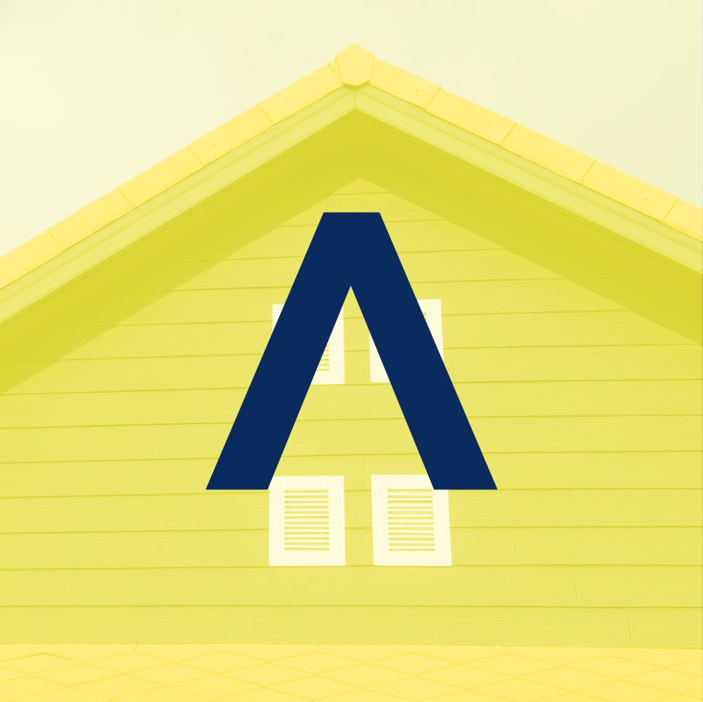
Stop trying to be so damn clever.
This logo redo isn’t ground breaking by any means. Surely, an A has been used in a logo to represent a roof before and when it has, I bet money that the "A" looks more like a literal roof than it does a legible letter.⠀
This is a problem with many small, blue-collar business logos. They're always so damn literal. Often at the expense of legibility. Logos are for identification, not communication. So legibility is practically the most important aspect of a logo to me.⠀
But the original Numark logo suffered from a different problem, a much more offensive problem: The generic swoosh.
Does your logo violate my list of the top 3 problems in small business logos?
Weak legibility (often because there’s some sort of icon or graphic replacing a letter in the biz name)
Generic swoosh
Too literal
I’ll be writing a lot more about these 3 problems in the future.
Agree or disagree? Hit me up and let’s talk about it.


