A suite of logo designs and usage guidelines for a rebrand of merging natural gas companies in Oklahoma.

“Rebranding can be daunting and overwhelming but Russell had a clear, well thought-through process to approach the work. He was able to break it down into stages/steps and that gave me confidence that we could tackle it together.”
— Ashley Hudgeons • Thurmond Marketing Director —
Thurmond McGlothlin is a leader in the natural gas measurement and manufacturing industry since 1946. Recently, two sister companies (Thurmond McGlothlin and Energy Meter Systems) planned to unite under the same name to establish a cohesive front in the marketplace.
We strategized on naming options, researched the competitive landscape, and defined an aspirational visual identity to aim for.
Thurmond’s new logo system elevates their perceived value. The distinctive mark expresses their 77 years of expertise while not coming across as too corporate. A new name and a new logo is the perfect way to signal to the market that it’s the start of a new era.
Challenge
Create a strong brand mark that will visually signal a company merger and rebrand to customers. The mark needs to address the shortcomings of the companies’ old logos (limited colors, difficult proportions, limited applications, poor legibility, etc.) while being properly positioned against the competition.
Outcome
The new flexible system of logos meets corporate goals because it retains the spirit of the two merging companies and sets a solid foundation for Thurmond’s evolving future.
Scope of Project
Logo Design
Logo Variations
Logo Usage Guide
“The roadmap worked! We ended up with a logo that meets our corporate goals and retains the essence of our company identity. I especially loved the mood boarding and check-ins at all critical stages. Russell was clear on deadlines and honest with me if he couldn’t meet them.”
— Ashley Hudgeons • Thurmond Marketing Director —
Know the competitive field before the design process starts.
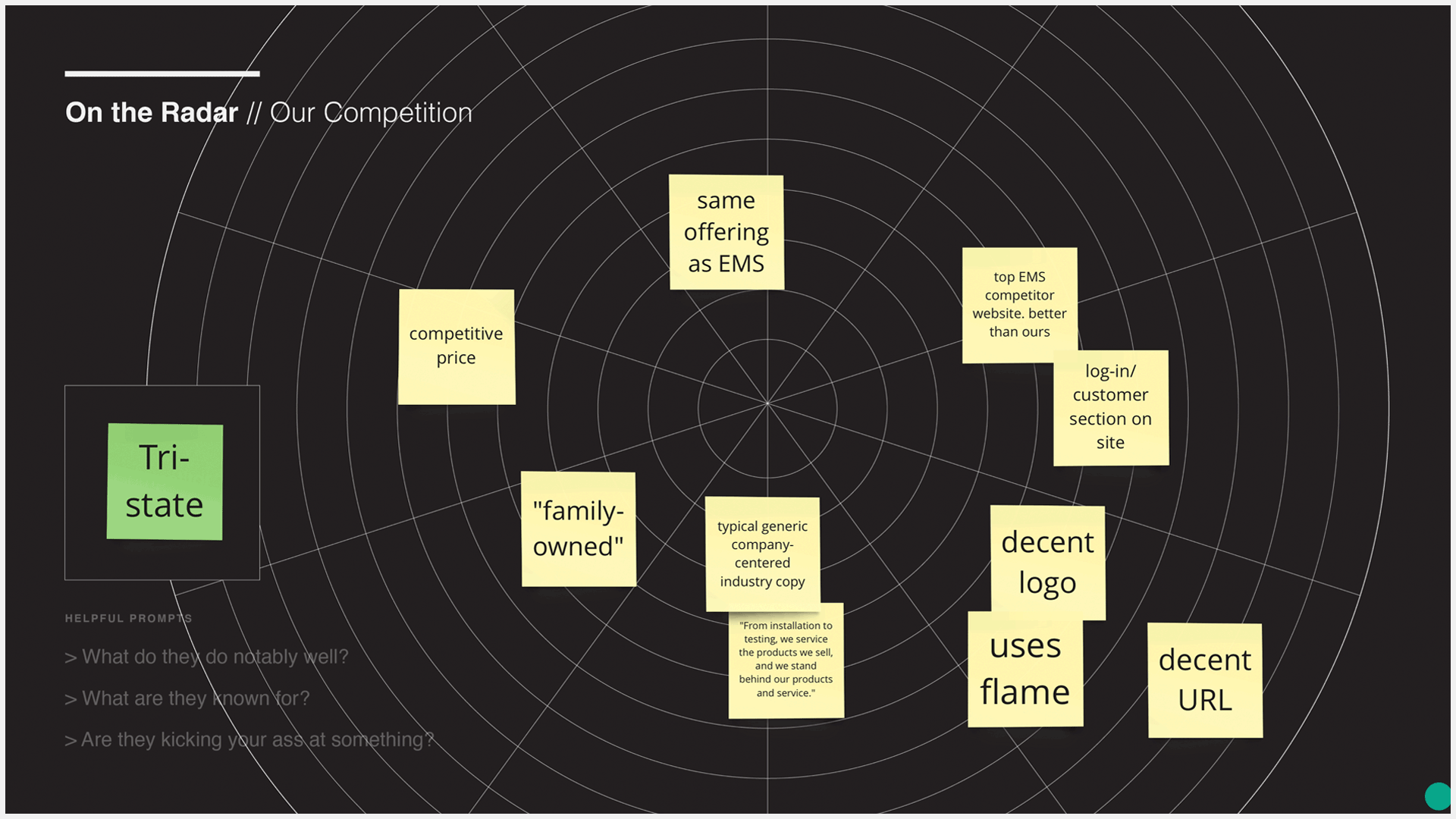
Competitive Research
To start, we had an informal workshop to discover and discuss what makes Thurmond different from their competition. It wasn’t a complete brand strategy workshop, but I did use exercises from my Brandslide workshop. The Roll Call exercise identifies as many competitors as possible in order to focus on the few that are most important. Next, we did several On the Radar exercises, recording notable things for each highlighted competitor. This competitive research showed us the cliches to avoid and potential opportunities to leverage.
Differentiation
The Be Different exercise showed us that Thurmond stands out from their competition in several categories like quality, range of offerings, expertise, and customer service. But the one thing that Thurmond can own that no other competitor can is legacy. Thurmond needed a visual presence that expressed that legacy.


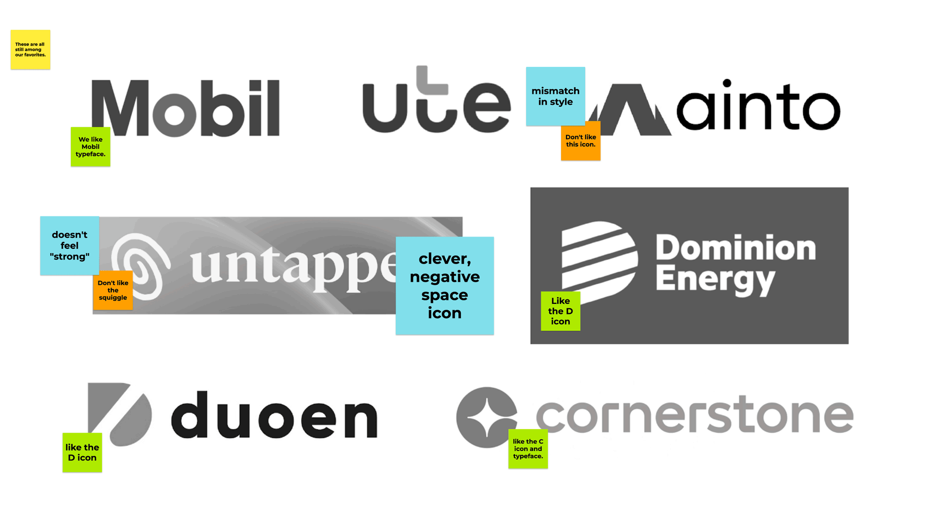
Defining a Direction
A few rounds of collaborative mood boards helped me narrow the field of what’s possible and what’s realistic. Mood boards help define a target; so we know where to aim. Otherwise, we’d just be shooting in the dark hoping we get lucky. A few patterns emerged and I was able to make a small checklist of do’s and don’ts in 5 categories: Style, Composition, Hierarchy, Legibility, and Feel.
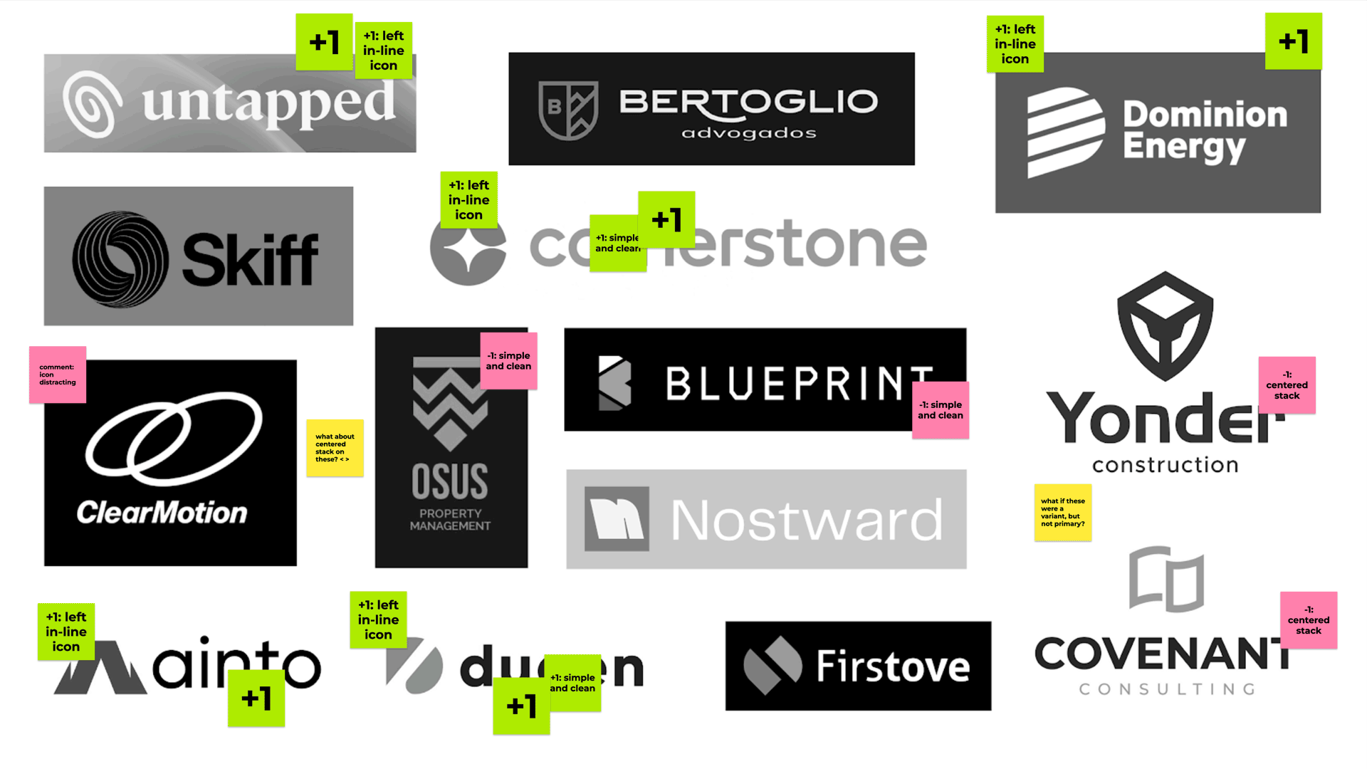
Most of the checklist was technical design stuff. But the most subjective category, Feel, was crucial. Thurmond’s new brand needed to have a sense of legacy. It needed to feel established without losing it’s friendly, colloquial charm.
A distinctive logo that’s appropriate for the market and easy to read.
With the design strategy out of the way, it’s time to execute. Visual research for the natural gas industry brings up some obvious stuff like pipes and flames. But because of our competitive research, we decided to stay away from literal representations. Still, there was something especially interesting about the turning and weaving pipelines. I saw potential.


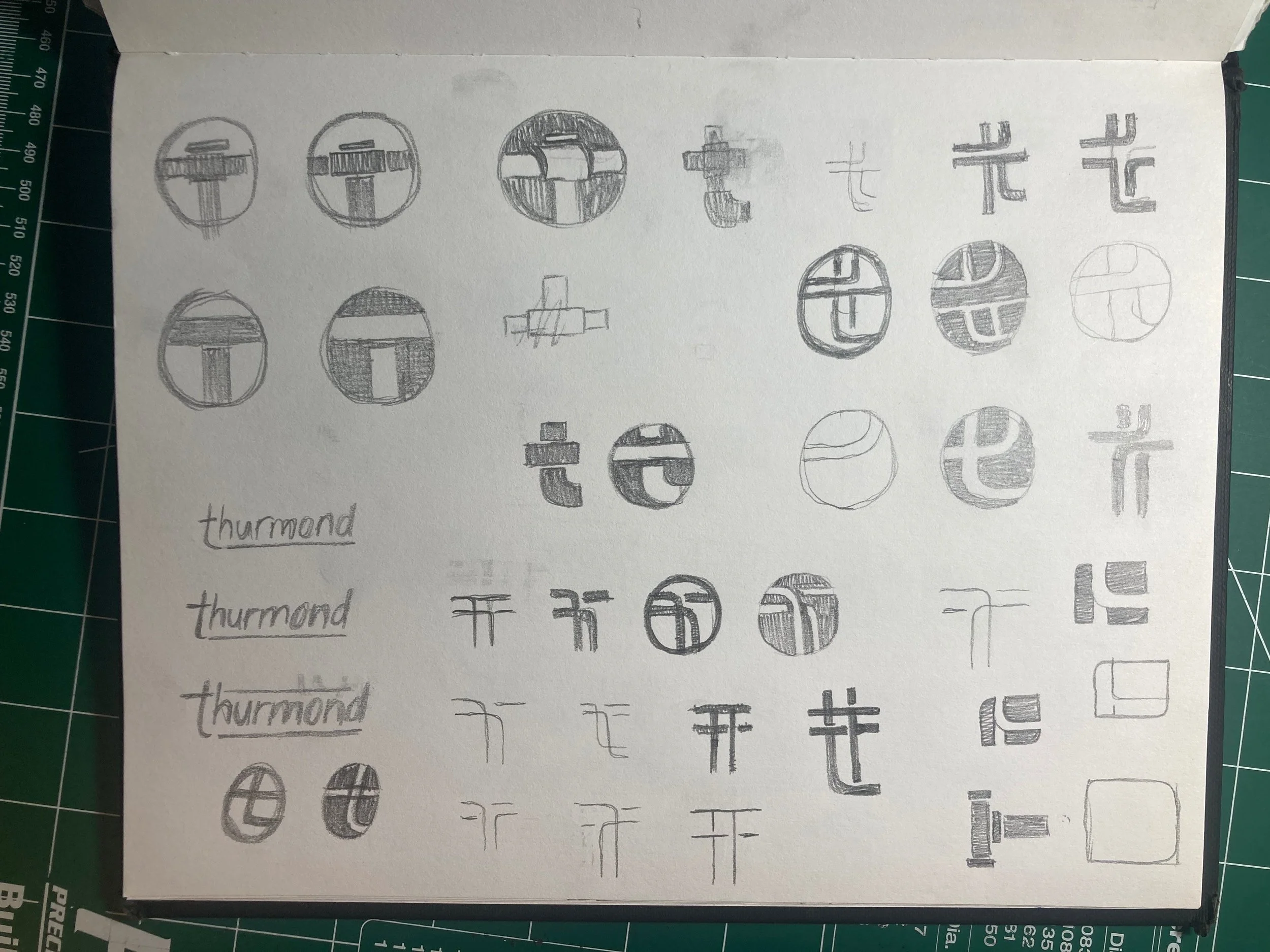
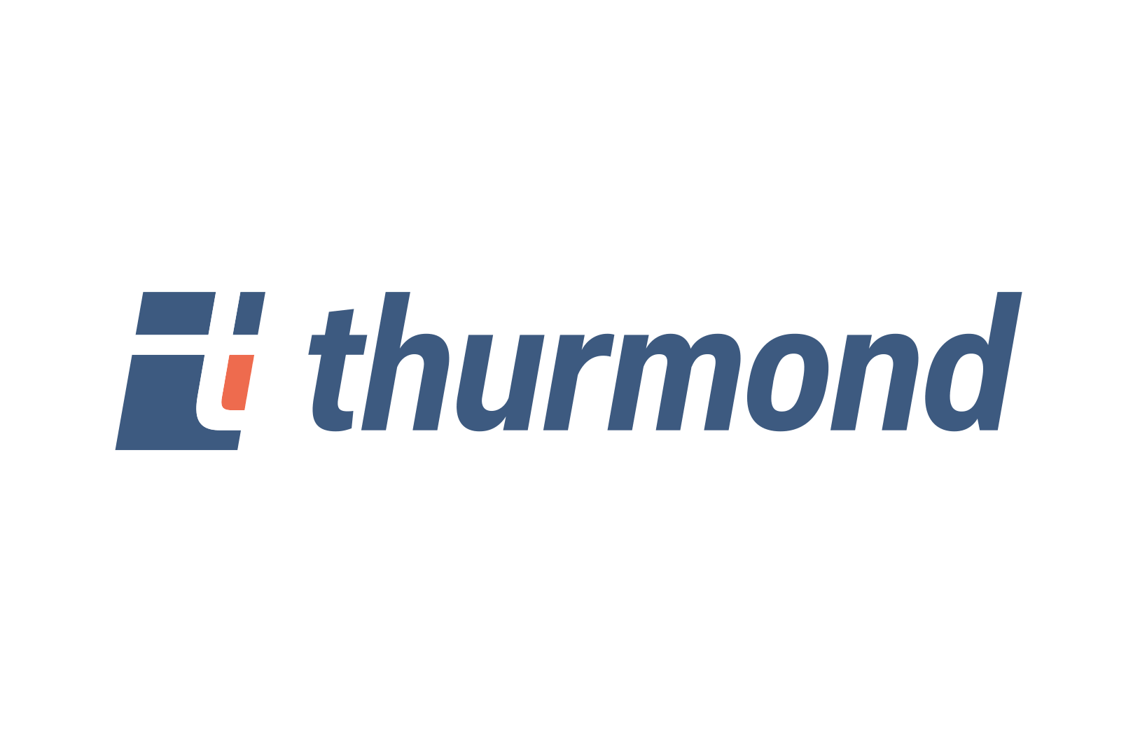
With a little abstraction and simplification pipelines can create letterforms. I created a custom T icon that borrows its style from the turning and crossing pipelines. It’s not obvious, and that’s the point. It’s a logo easter egg.
The main word mark is set lowercase, in a modern typeface to feel more approachable and informal. Established but not too corporate.
Together, it’s a distinctive logo that doesn’t try to do too much.
Secondary and tertiary variations were created as well. These give the Thurmond logo the flexibility it needs to be used and leveraged in all contexts, modern and traditional.


A usage guide helps with decision making when using a flexible system of logos.
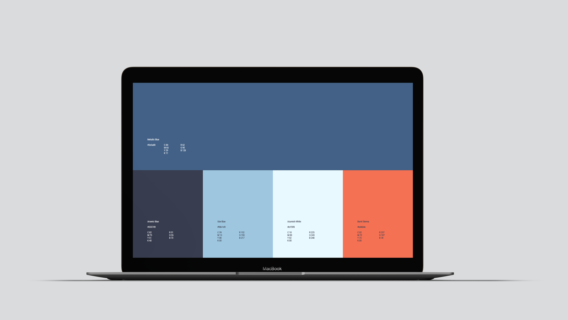
What good is a fancy new system of logo if you don’t know how to use them? Thurmond’s logo usage guide is an 11 page document that outlines the general do’s and don’ts for they systems. It includes things like best practices for using variants, colors, color combinations, typefaces, minimum sizes, clear space, and incorrect graphic treatments.

“There were no big surprises along the way. Russell was thoughtful and calculated from beginning to end. He’s an active listener, a clear communicator, a problem solver, and patient. Russell was easy to work with, managed my expectations so well, and in the end, delivered a unique, creative product.”
— Ashley Hudgeons • Thurmond Marketing Director —