A logo and brand identity for a new neighborhood at the heart of Route 66.
Sand Springs, Oklahoma is a genuine slice of Americana situated along the iconic Route 66. A small region of town called Town West had become an industrial trucking corridor spotted with rundown strip malls and mid-century hotels.
TSW is leading the revitalization project and hired Medium Giant to handle the naming and branding of the reimagined neighborhood.
The project wasn’t perfect. But the big problems were navigated safely and we arrived at our destination: A distinctive identity that embraces the spirit of the neighborhood. A small region of Sapulpa proud to be inspired by trucking lore and Route 66.
Challenge
A small Sapulpa neighborhood needs a visual overhaul that doesn’t completely whitewash its past. Create a new identity that authentically embraces the spirit of the community while managing the perceptions and desires of multiple individuals from multiple organizations within the project.
Outcome
An inclusive approach to collaboration ensured a successful project. The new branding embraces a trucking and road trip aesthetic to create a unique and memorable identity. It subverts expectations by incorporating surprising design elements that leave a lasting impression.
Scope of Project
Brand workshop
Naming
Identity System
Brand guidelines

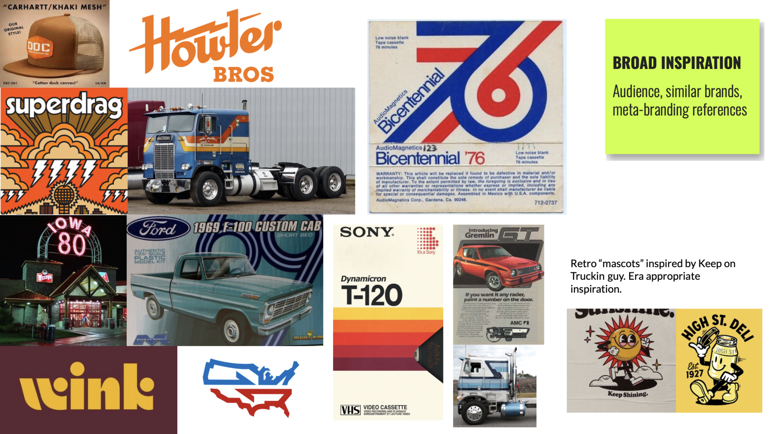
Embracing the grit and aesthetic of the area for branding inspiration.
Medium Giant facilitated a workshop with TSW and the City of Sapulpa’s steering committee to establish a brand strategy (this was done before I was on the project). When I received the strategy brief and recordings, a few things stood out to me.
The steering committee seemed to have several members absent – weird
The committee self-identified as the Rebel archetype.
Sweet Potato. Let me explain…
Medium Giant had introduced the strategy process by jokingly presenting that “Sapulpa” meant “sweet potato.” An extremely quick and crude Google search will give you such results as: Named for James Sapulpa, a Creek, near whose home a railroad construction camp was located. The name is a Creek word meaning "sweet potato."
Doing this was really nothing more than a way to break the ice and begin the conversation about who the city of Sapulpa is as a brand and client. But I was watching a recording of the workshop so I was able to read the room more than normal. It was obvious that the group responded positively to the sweet potato thing. I even heard a quote of inspiration that hit me like a bolt of lightning: “I yam what I yam.”
Oh yes, this is gonna be fun.
Ultimately, two phrases came to embody the brand to be and acted as a shortcut to access the spirit of the strategy.
Our grit is our gold
This captured the brand's attitude toward the "undesirable" aspects of the area.
It costs a lot of money to look this cheap
Dolly Parton’s famous quote tapped the self-aware humor and fun of the brand.
With this strategic foundation we started on mood boards to show 2 distinctive visual directions that would support the brand strategy.
Direction 1 was called Modern Road. It was considered trucking adjacent. A few of the key words used to describe this direction were “rebellious retail” and “unexpected lux."

Direction 2 was Trucking Lore. This direction was rooted in nostalgia and openly embraced the culture and visuals of trucking. It is heavily inspired by the bold decals and pinstriping on old semi trucks.
Trucking Lore was the overwhelming favorite. Everyone loved it. Easy peezy.
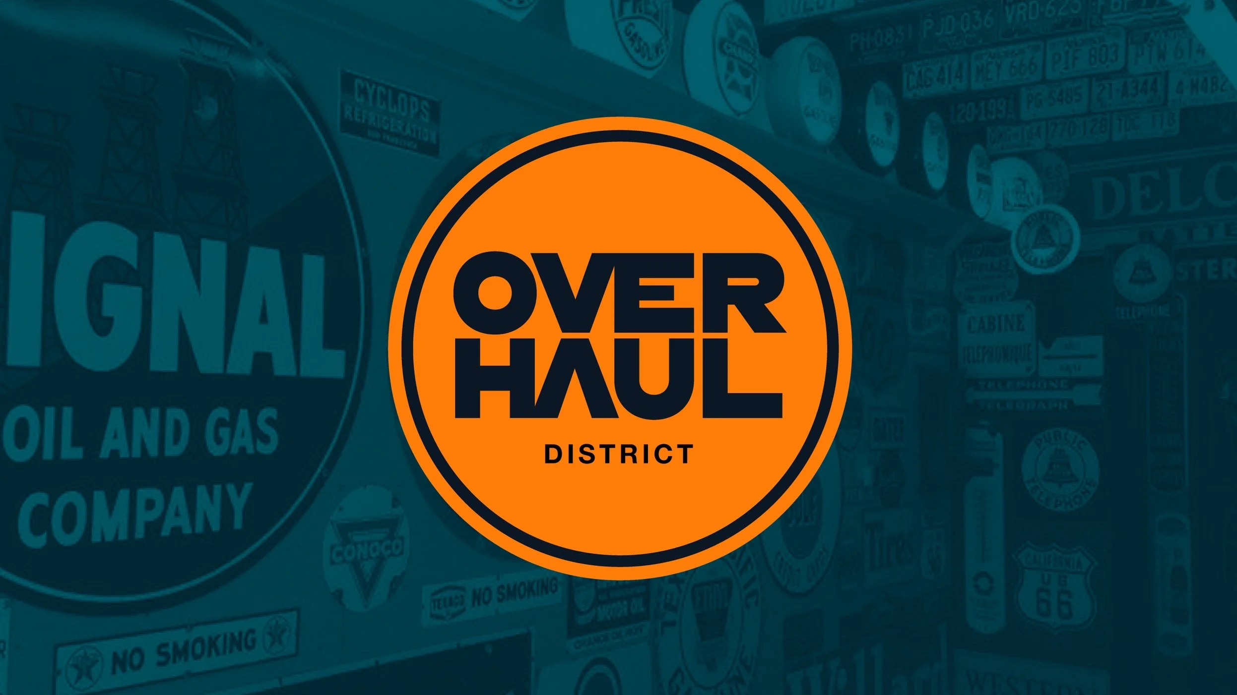
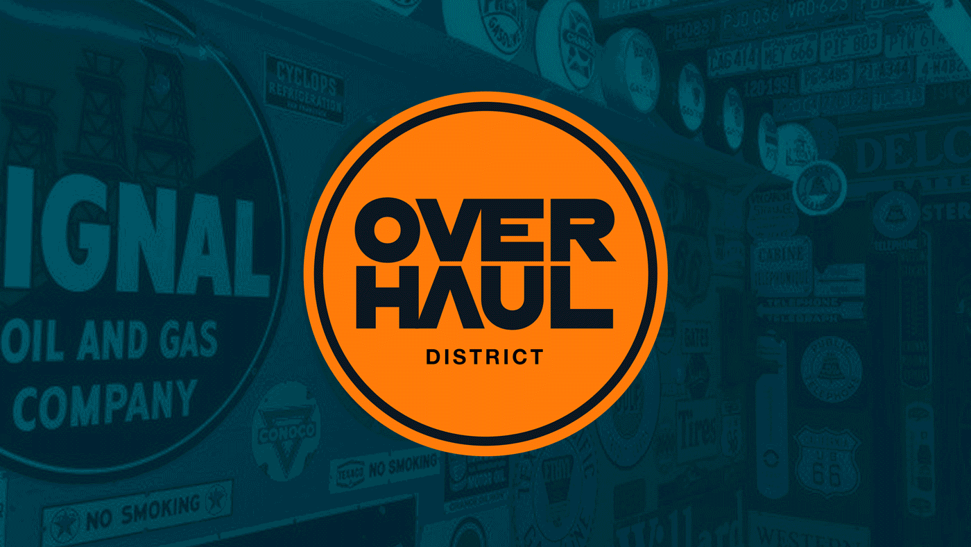
Next was naming. TSW needed a name for the actual development project and Sapulpa needed a name for the newly renovated region. We aimed for a name that worked in both scenarios. This would mean more awareness and more equity in the long-run. After some brainstorming, it became obvious: Overhaul.
Project Overhaul would become the development’s project name. Then once complete, the renovated area would become known as The Overhaul.
Again, everyone loved it. Man, this is too easy.
Two logo and branding concepts based on Trucking Lore.
MG presented multiple concepts for client review (the 2 I was responsible for are shown here).
Concept 2 tapped extra hard into the nostalgic aesthetic and retro color palette from the mood board. The big bold color bars and sweeping stripes on old semi-trucks were a huge inspiration. The concept even showed how the stripes could be used in merch, signage, and other practical applications, not just for style.
The client liked it, but it wasn’t our winner.


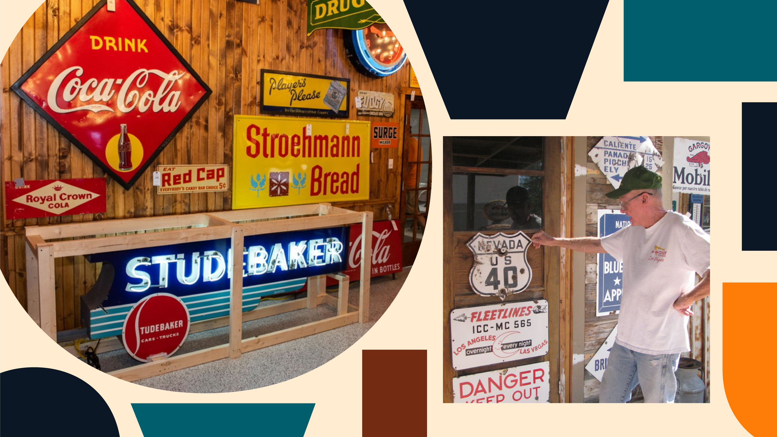
Concept 3 took a slight detour from the “Trucking Lore” brief and focused on the unique aesthetics of the area: Route 66, transit, train tracks, roads, pit stops, and signs. A lot of signs.
The warm earthy colors capture the essence of Oklahoma’s landscape and aesthetic. The cooler hues are an homage to the heritage of trucking and the enduring legacy of Route 66. This concept used HWT Konop, a distinctive and vintage-inspired font known for its bold and robust letterforms. The typeface draws inspiration from traditional woodblock typefaces, evoking a sense of historical craftsmanship and authenticity. Its rustic and nostalgic aesthetic makes it a popular choice for projects where a touch of heritage or a classic Americana feel is desired — Thanks ChatGPT

The main idea behind the logo was born by seeing a connection between some early type experimentation and a railroad crossing sign. With OVERHAUL stacked in two lines, the V and A line up to effectively make a big X. And it’s this little connection that led the entire identity to be driven by “signs.”


There’s no shortage of sign collections in the kitschy shops and restaurants along Route 66. So, to build up a custom version of that visual language, the individual letterforms of OVERHAUL were expanded into solid containers. This created a unique sign collection within the identity that could be used as shapes, containers, masks, patterns, etc.

And then, a sweet potato. The idea for a mascot popped up simply because they were more common in this retro era. Robert Crumb’s famous Keep on Truckin dude became the key inspiration. This was also a subtle lean-in to the rebel archetype (Research Robert Crumb to understand why). So, meet Tate. It’s short for Tater… short for Sweet Tate the Great.
Tate just fits the aesthetic of Route 66. In fact, his eyes are two 6’s. It’s easy to imagine him as a large freestanding statue meant to be another one of the mother road’s bizarre roadside spectacles. Not to mention the merch. The possibilities were endless. All hail Sweet Tate the Great.

Separately, we had a bunch of ingredients. But when it was all stirred and mixed together we had a fun identity. Tate, the eyes, the signs, the logo, it was all self-aware and fun with endless merch potential (I get stoked just thinking about a Tate the Great hat). The identity embraced the rebel archetype in unexpected ways. And what’s more rebellious than that?
They loved it. Pack it up folks. We’re done here… or are we?
The concepts and ideas had been accepted with overwhelming approval and love. But several stakeholders had been repeatedly absent. The math wasn’t adding up. It was unsettling.


Losing Tate and the name.
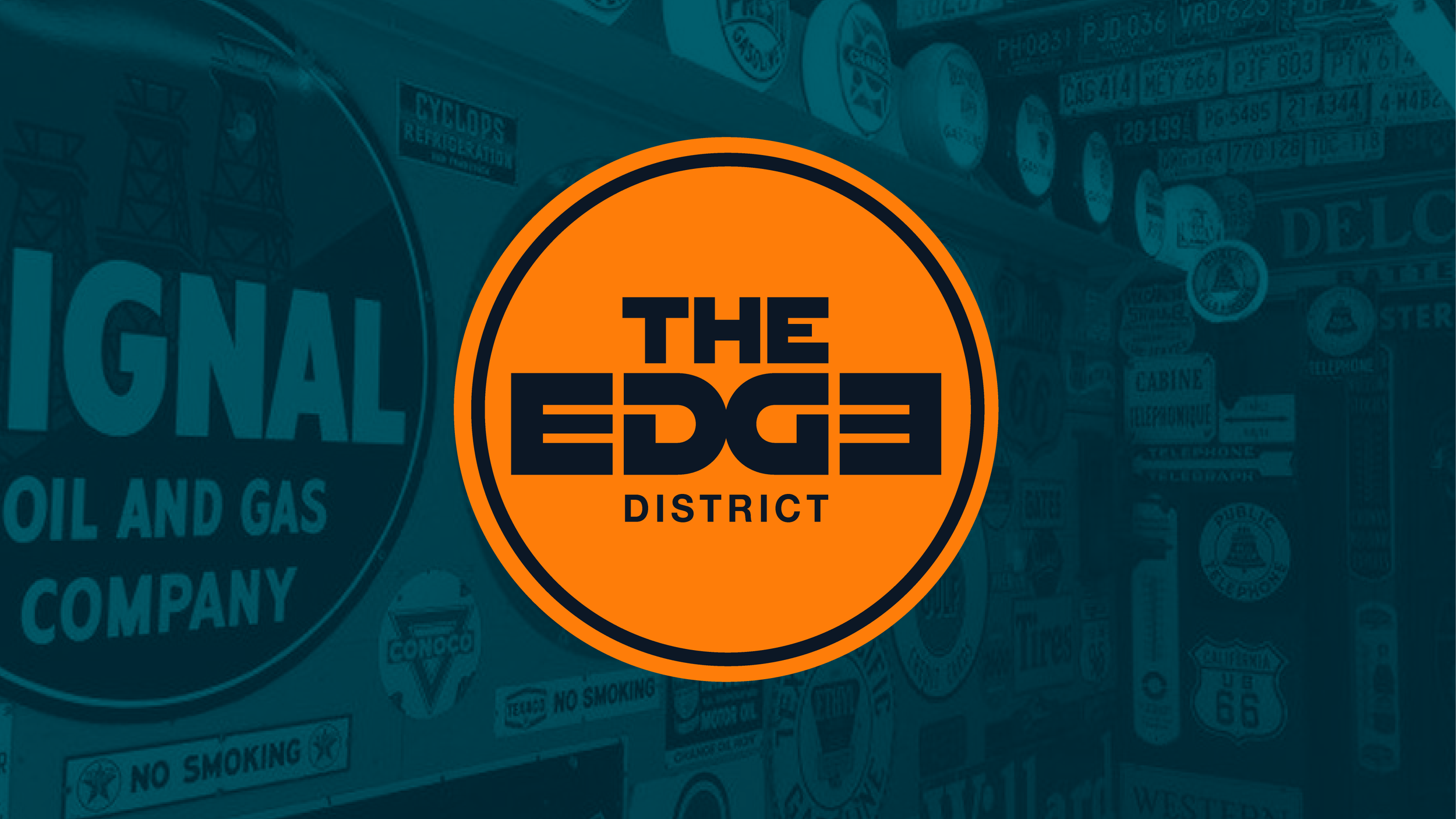
In the end, the OVERHAUL name and Tate were vetoed late in the process (RIP Tate). The challenge became reshaping the identity around a new name (Project Edge/The Edge).
Coming together and incorporating late client requests into the beloved branding.
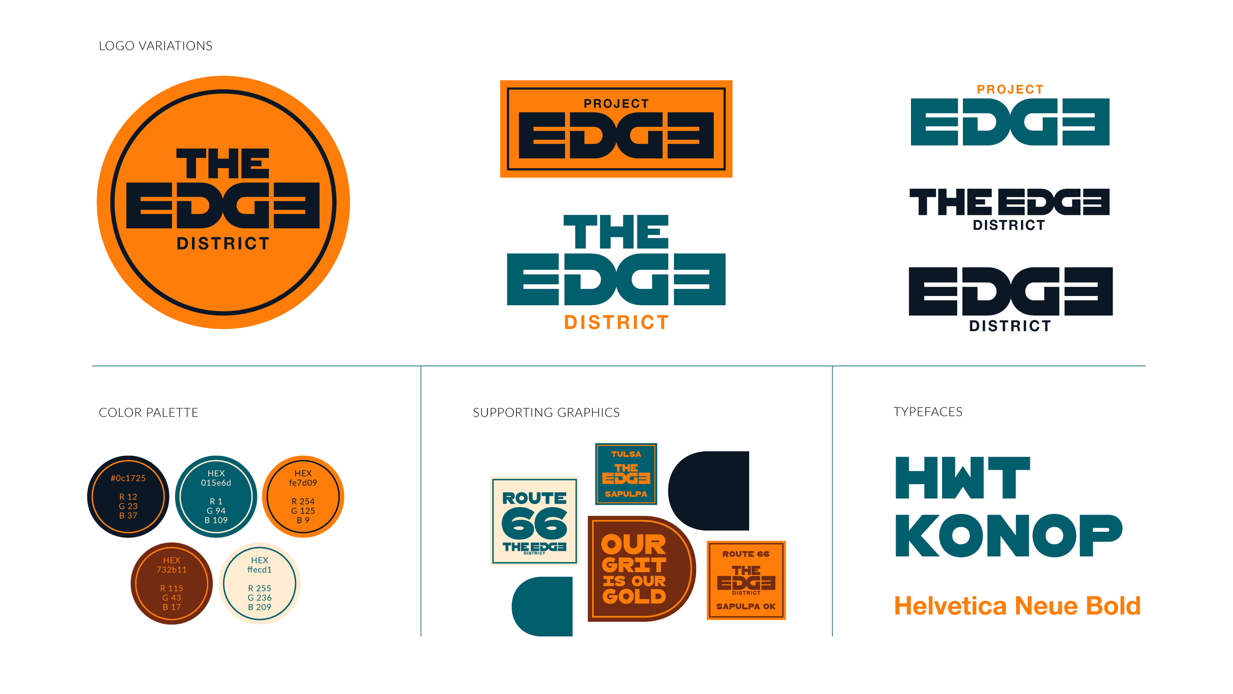
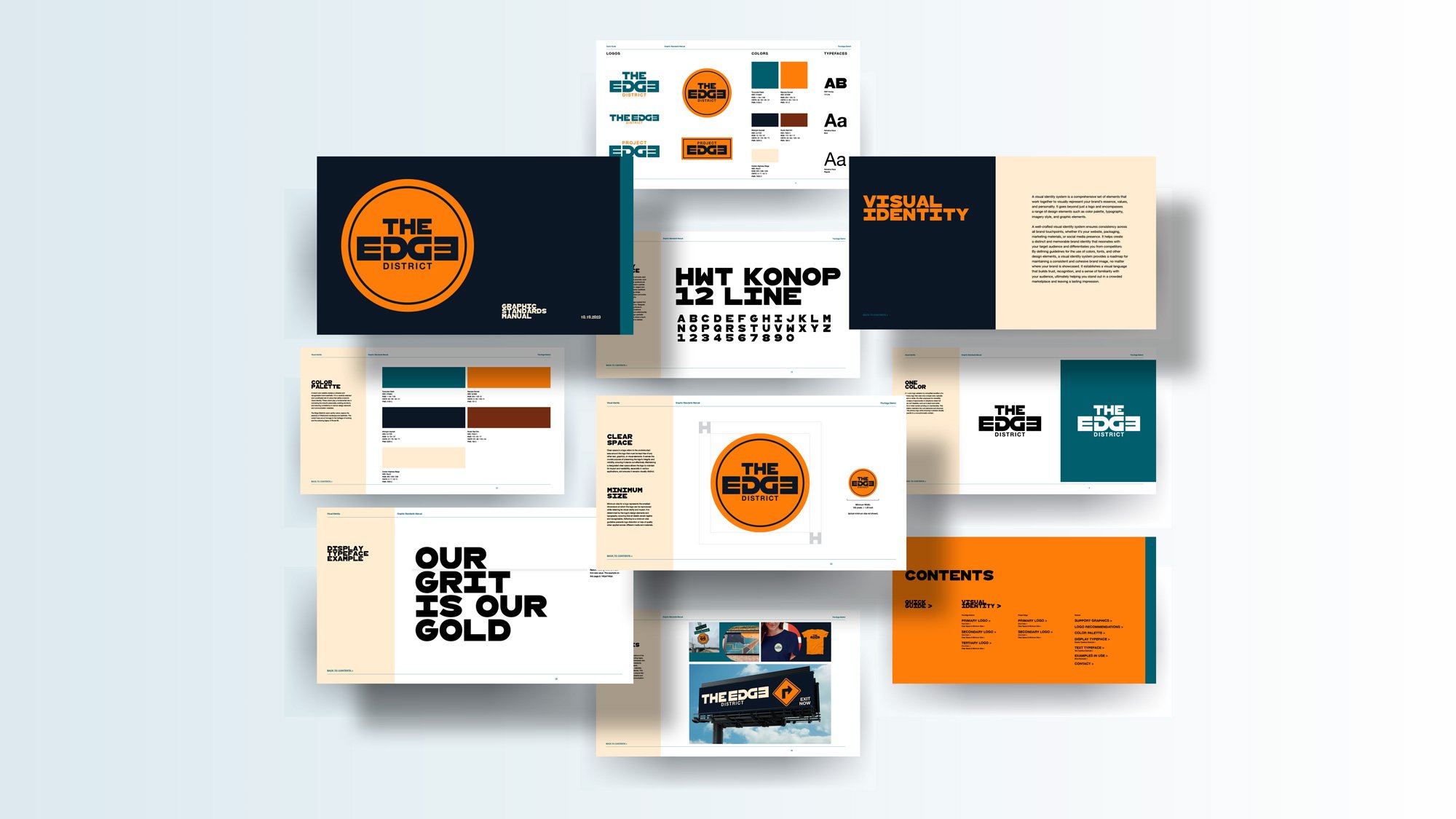
The new logo incorporates an ambigram. The ED and GE are symmetrical forms that create an EDGE symbol that is still legible when viewed (or rotated) upside down. The symmetry represents the two areas, Sapulpa and Tulsa, coming together.
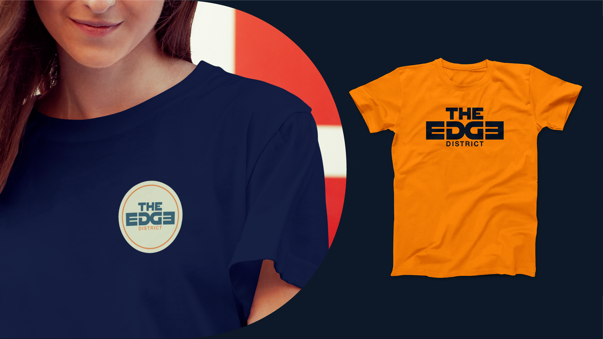
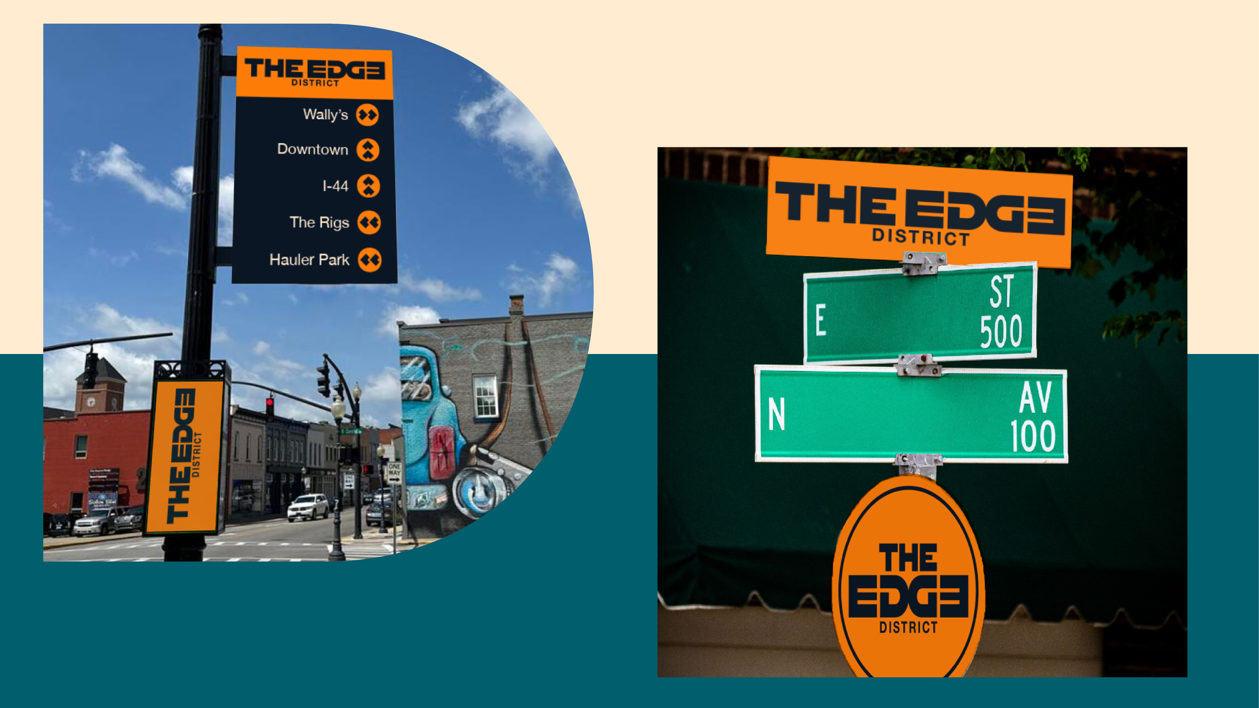
Support graphics for The Edge District remain mostly the same Route 66 inspired sign collection. The EDGE letterforms are now the expanded primitive shapes that organize or separate information.


All work completed as Senior Designer at Medium Giant