A full rebrand, brand identity system, and merch design for a BMX company in Florida.

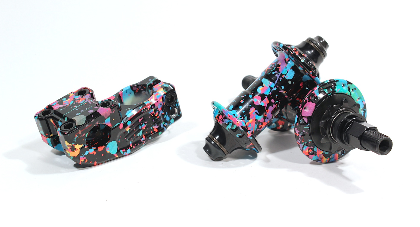
Madera is a niche BMX components manufacturer. They produce American made bike parts and despite being seen as a small brand, they are sold in 107 countries and ship about 1500 units a year.
I increased brand recognition and enabled Madera to be perceived as the incredibly valuable brand that they are by flipping a confused image into a powerful and distinctive identity.
BMX trends are constantly evolving so I wanted to let the timeless craftsmanship of their products shine.
Challenge
Clarify the brand’s identity and positioning as well as increase brand recognition.
Outcome
I helped Madera simplify a mess of disconnected logos into a single, consistent identity system. A new look, tone, and voice that is authentic to the brand’s values. This resulted in a significant increase in sales of products with the new branding. Engagement increased dramatically on social media due to enthusiastically positive feedback.
Scope of Project
Brand Strategy
Identity System Design
Merchandise Design
Website
“We were apprehensive to make any changes to our image but Russell's research proved our inhibitions wrong.”
— Mike Hinkens • BMXer • Brand Manager
The most important thing about rebranding is being sure a rebrand is the right thing to do.
To begin, I had a few discovery conversations with the Madera Brand Manager to establish the goals, desires, and pain points of the brand and its customers. With this strategic approach, we were able to clarify the brand's ideal customer, define what makes Madera unique in a commoditized market, and discover many other valuable insights to use as the foundation for all of their future branding plans.


To identify the ideal user in an already niche industry, get ultra specific.
Madera isn't a brand interested in growth and profit for the sake of it. They are committed to supporting the culture of BMX. We identified their ideal customer—a specific type of dedicated core rider who makes it his or her life goal to give blood, sweat, and tears for the sake of progressing bike riding (newcomers looking for the new flavor of the month can move along).

Brands are like people. So, what kind of person is the brand?
The discovery conversations made it easy to clarify the brand's key personality traits. If Madera were a person, it'd be that riding buddy you always text first. The homie always down to sit for 2 hours and encourage you on your battle for the new trick. The friend that enriches your life on and off the bike. We defined a mission, vision, value proposition, and brand attributes to act as our lighthouse. These assets guided the look and feel of the identity in addition to guiding all brand decisions in the future.

Know the audience to properly position the brand in their mind.
BMX is becoming a commoditized market, so we had to define what makes the brand special beyond a price point. Madera is made in Florida by the well respected and high-priced heritage brand Profile Racing. Being made in America is admirable, but it doesn't mean much to the newer generations of BMXers. So we decided to focus on the WHO rather than the WHERE: Madera offers Profile Racing level craftsmanship and quality at a competitive price.

Mixing the strategy with iconic product features to create a distinctive logo and brand system.
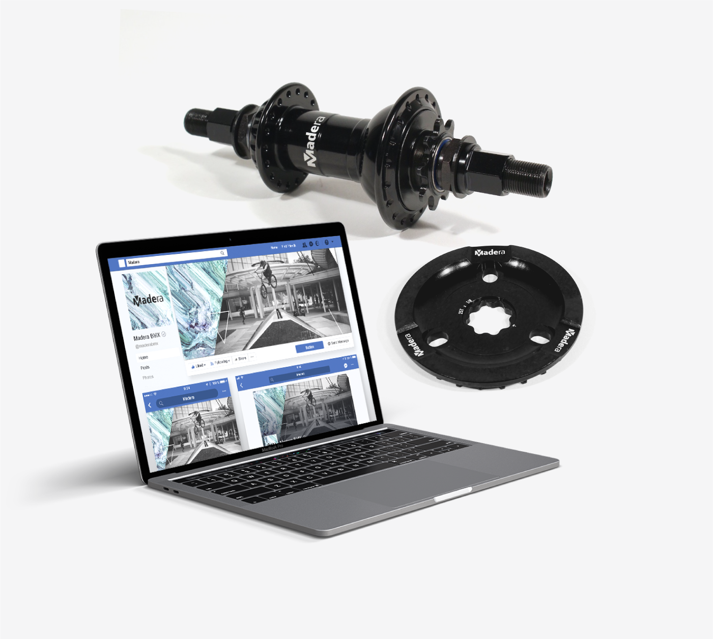
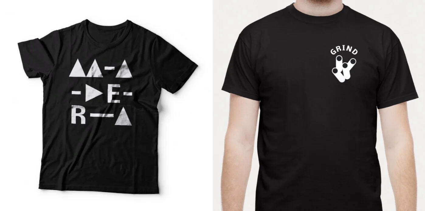
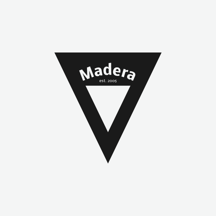
With the insights from the strategy work, I designed a thorough identity system to create a consistent visual style for all of Madera’s touchpoints. This included a new logo, new color scheme, a new typeface, and many more assets. The new identity was inspired by the distinguishing physical feature of the brand's most iconic products, the 48 spline crank spindle. The new Madera logo combines a simple, crafted wordmark with a customized M icon that is a minimal representation of the spline interface.

Setting certain letters in a heavier weight placed an emphasis on MADE. This was done to emphasize the craftsmanship of their products and reinforce their differentiation: being MADE BY PROFILE. Some might say it’s not perfectly legible, but we decided together that it was more important to focus on dedicated BMXers; those who already know the brand and the pronunciation. And if they don't yet know, they will soon have the "ah-ha" moment when they figure out the visual trick and then never forget the brand logo).

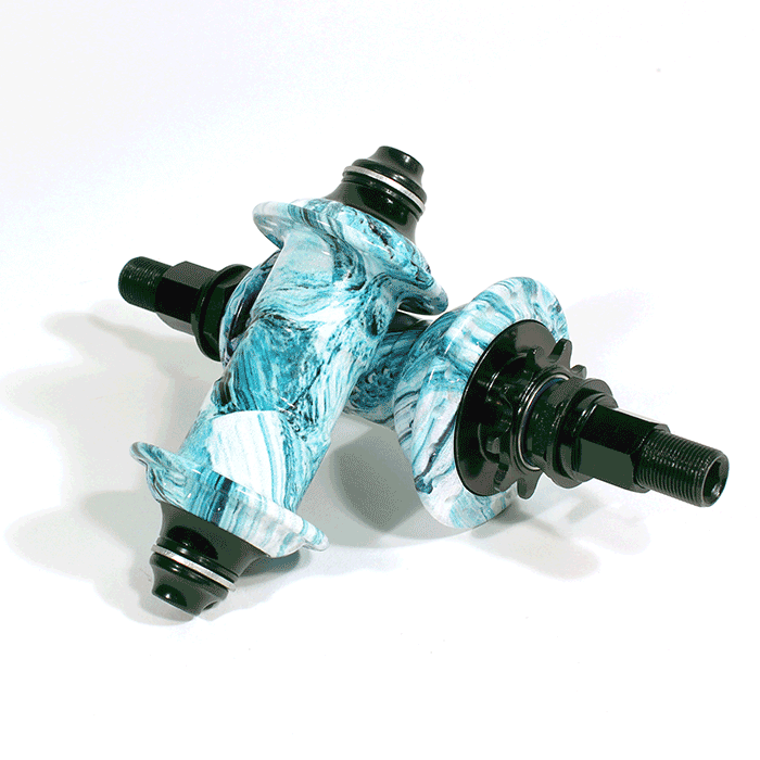
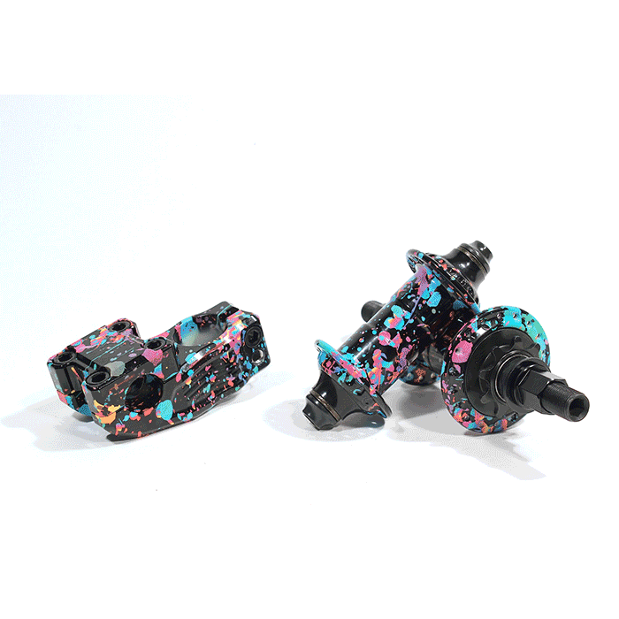
Madera already limited the color variations of the products they offer. I decided that we should lean in on their color constraints rather than over-investing in new brand colors that would never be used in hard goods. So, Madera's palette consists of a custom black and white primary palette with their limited edition product colorways acting as the supporting palette.


“The high quality work Russell did was only a fraction of the value we got. His explanations and numerous consultations will allow us to implement and benefit from his work for years to come.”
— Mike Hinkens • BMXer • Brand Manager


A properly designed brand system makes designing merchandise easy.
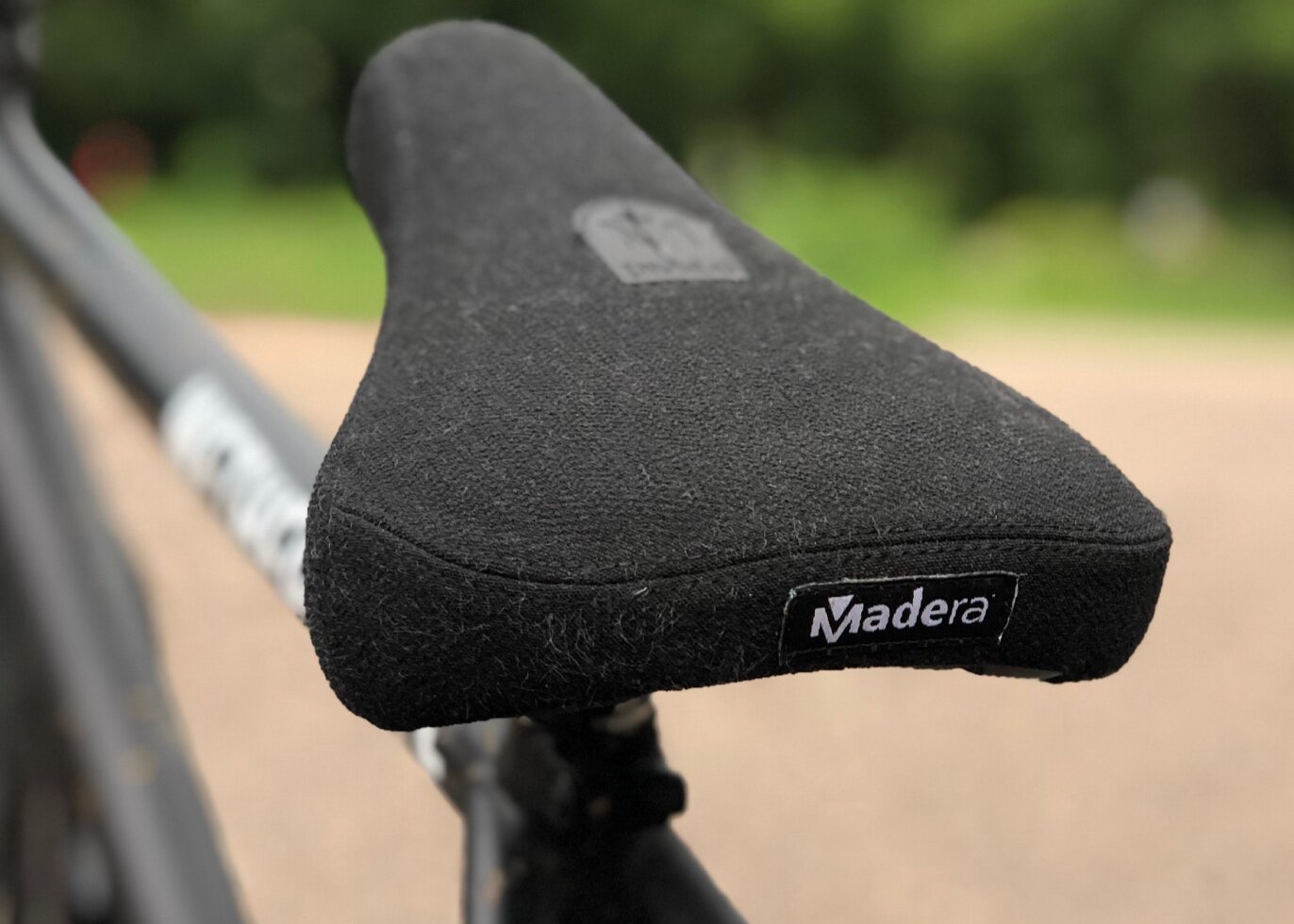
Working within the visual style and brand attributes we had established, I designed a collection of assets that Madera could take with them into the future seasonal releases of apparel, stickers, hats, etc. All of these created additional touchpoints to allow Madera to express their brand personality and build their tribe. This strategy also elevated them above the industry’s standard procedure of a thoughtless logo-slap or the boring brand-name-in-a-new-font t-shirt.
Customers and riders are happy to have branding on par with the quality and craft of the products they love.
Madera showcased their new identity and minimalist look with a limited edition sprocket that quickly sold out. They continually receive positive feedback and requests for product with the new look as well as increased demand for softgoods. The new identity and narrowed focus have increased morale among Madera's team of sponsored riders as they are now more motivated to represent something they are proud of. Even the owners and product designers are proud to have the new identity because it complements their creations and craftsmanship. More than ever before, Madera’s tribe is more engaged and motivated to purchase products and to act as ambassadors for the brand.