
Making public health feel personal
When Tulsa Health Department’s busiest location underwent a much-needed renovation, they updated the flooring, furniture, and paint. But it was clear the visual refresh needed to go further. I helped align the space's aesthetic and messaging with the organization's mission and the staff's daily commitment to care.
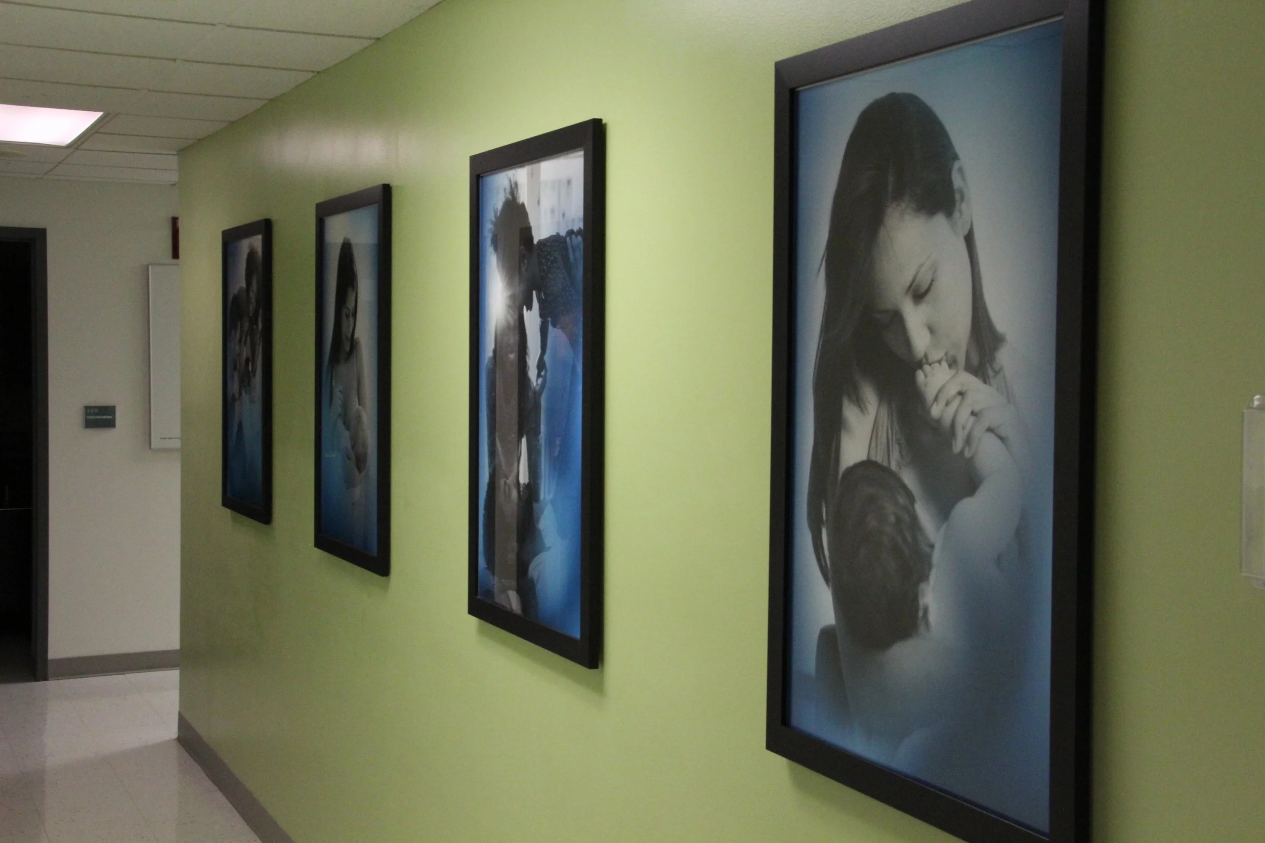
My role covered wayfinding, environmental graphics, fine art curation, and most importantly: murals, cross-promotional service posters, and public-facing messaging. The goal was to create a welcoming, cohesive environment that matched the new interior design while improving how clients experience the building and how they feel while they’re there.
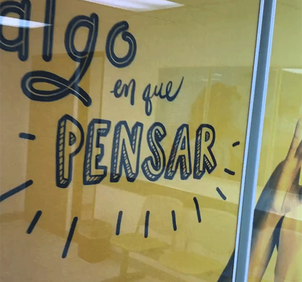
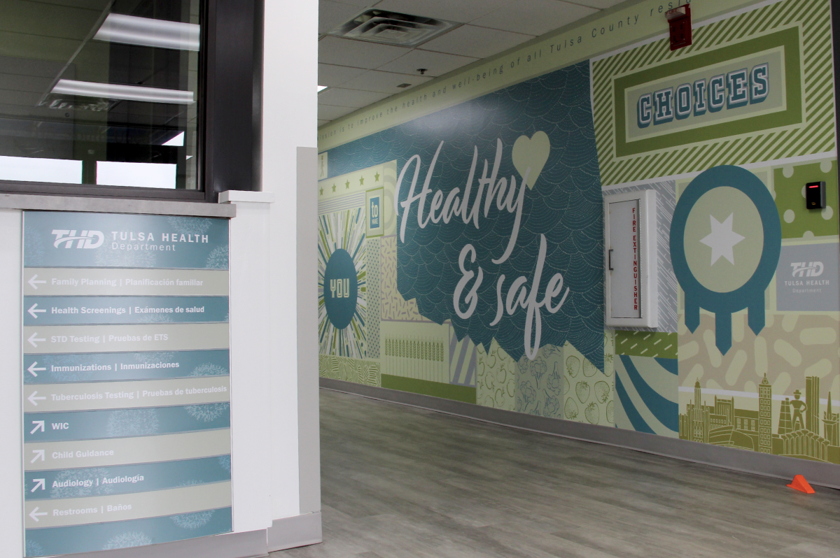


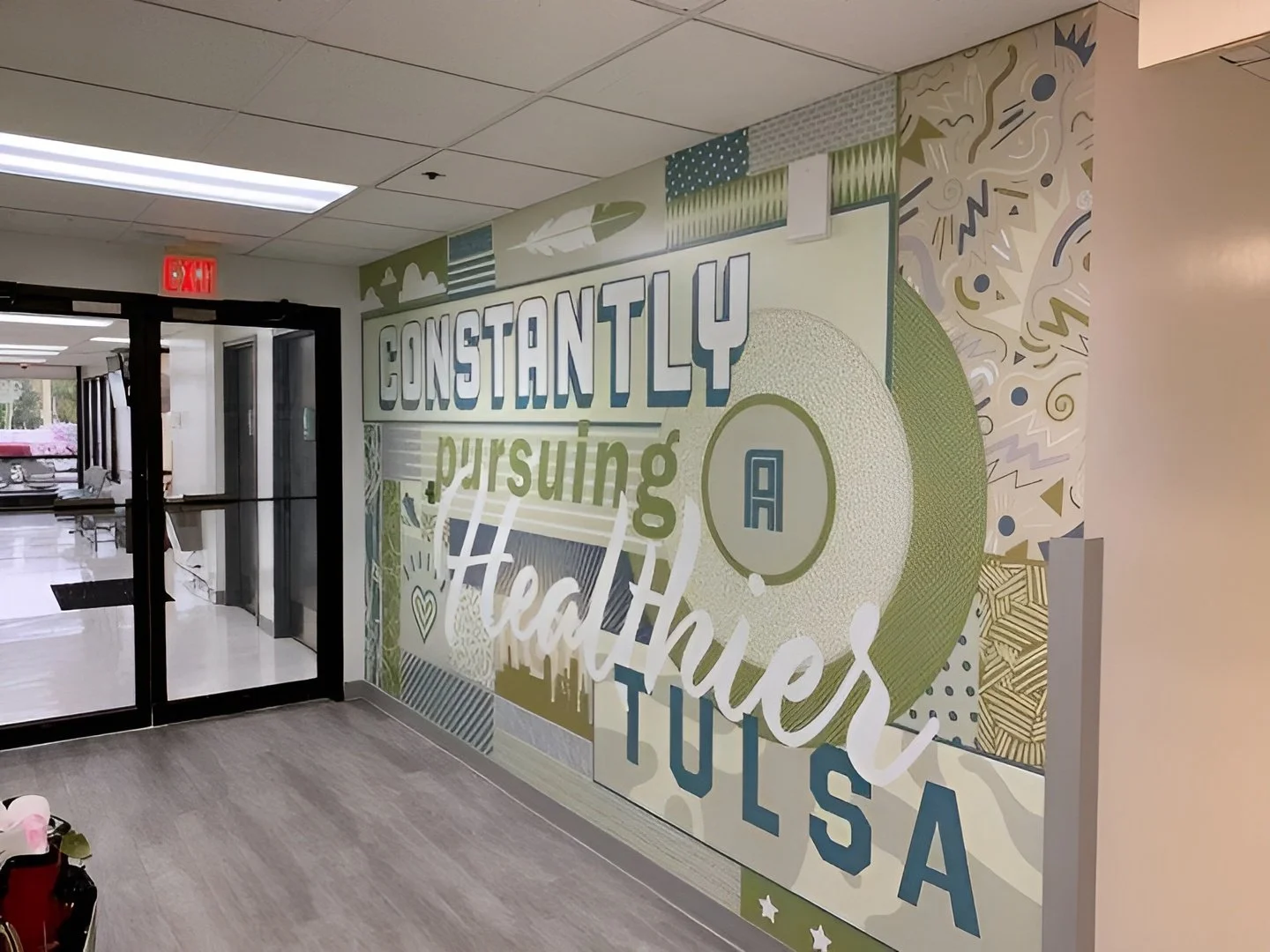

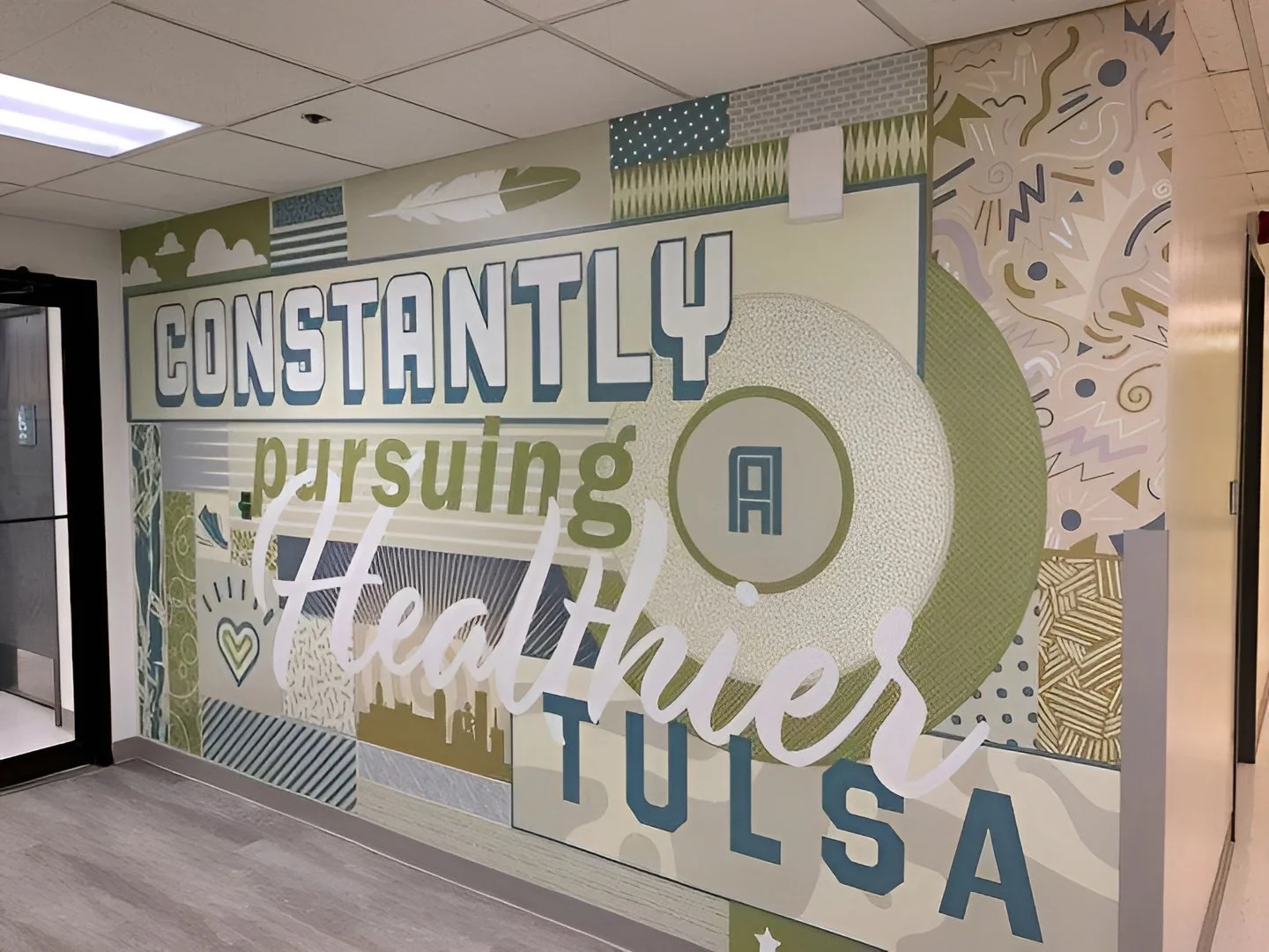
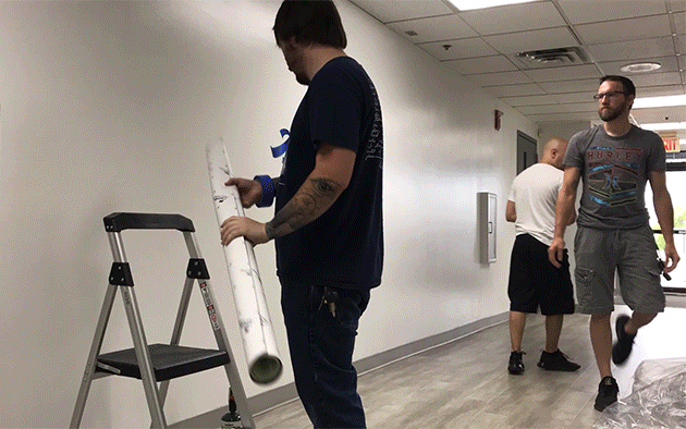
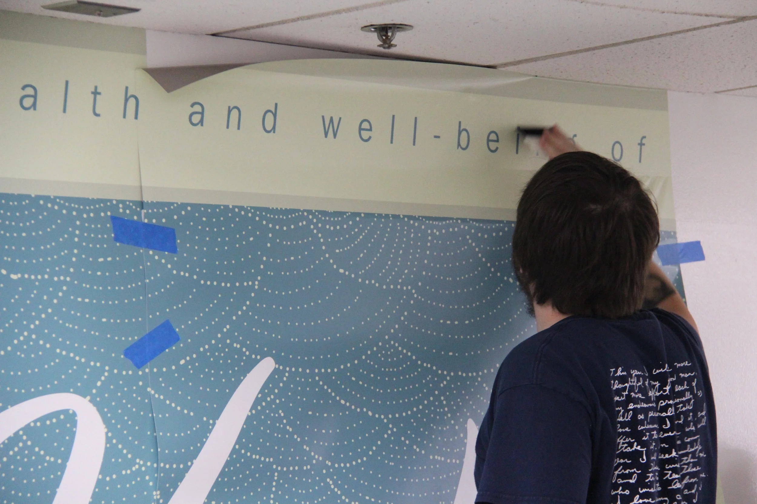
Murals that speak to the community
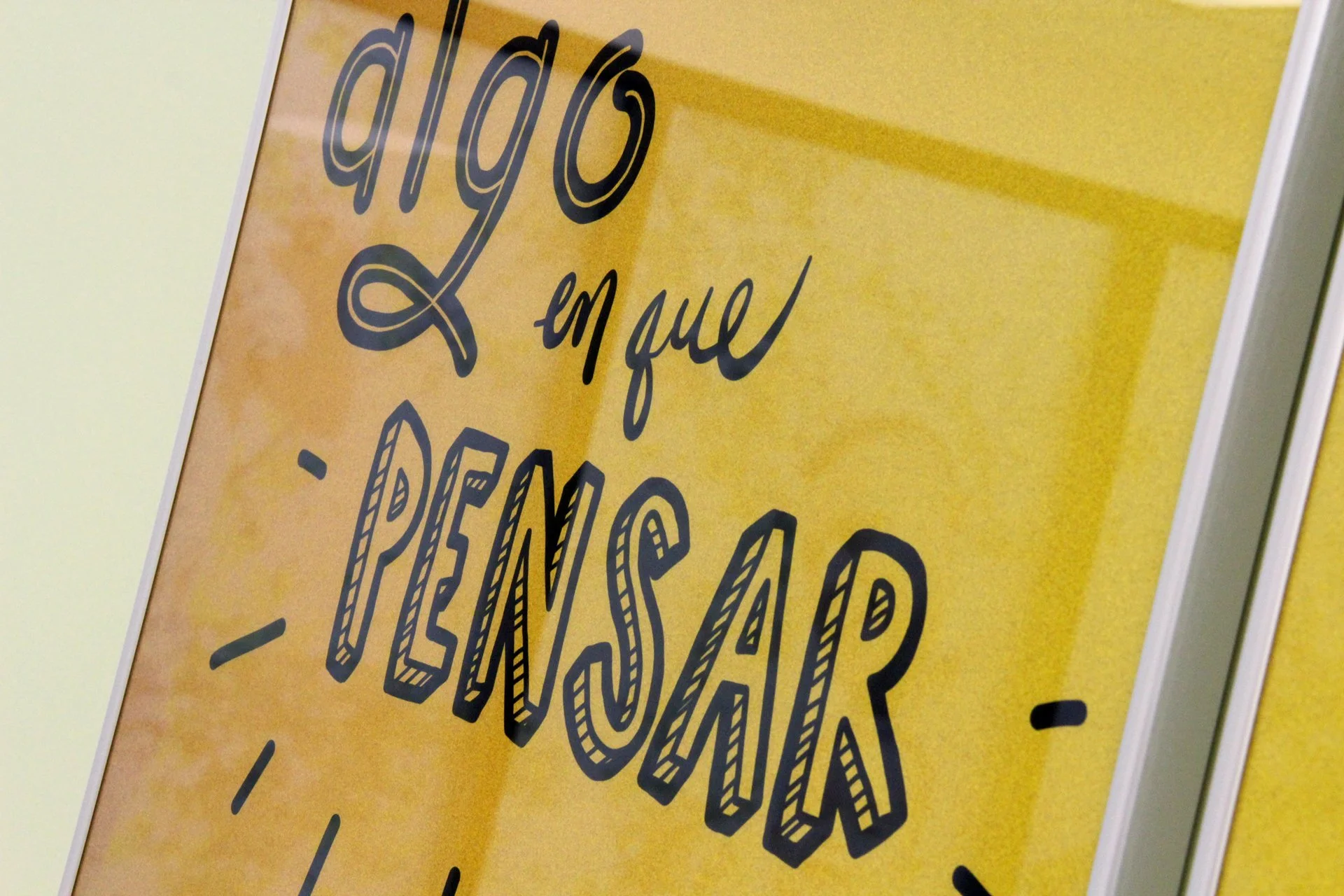
The centerpieces of the environmental work are large-scale murals in the main corridors designed to greet visitors as they enter. Inspired by THD’s mission and core values, the murals were written to speak directly to the community, not at them. They set the tone for the rest of the experience. Friendly. Grounded. Community-first.


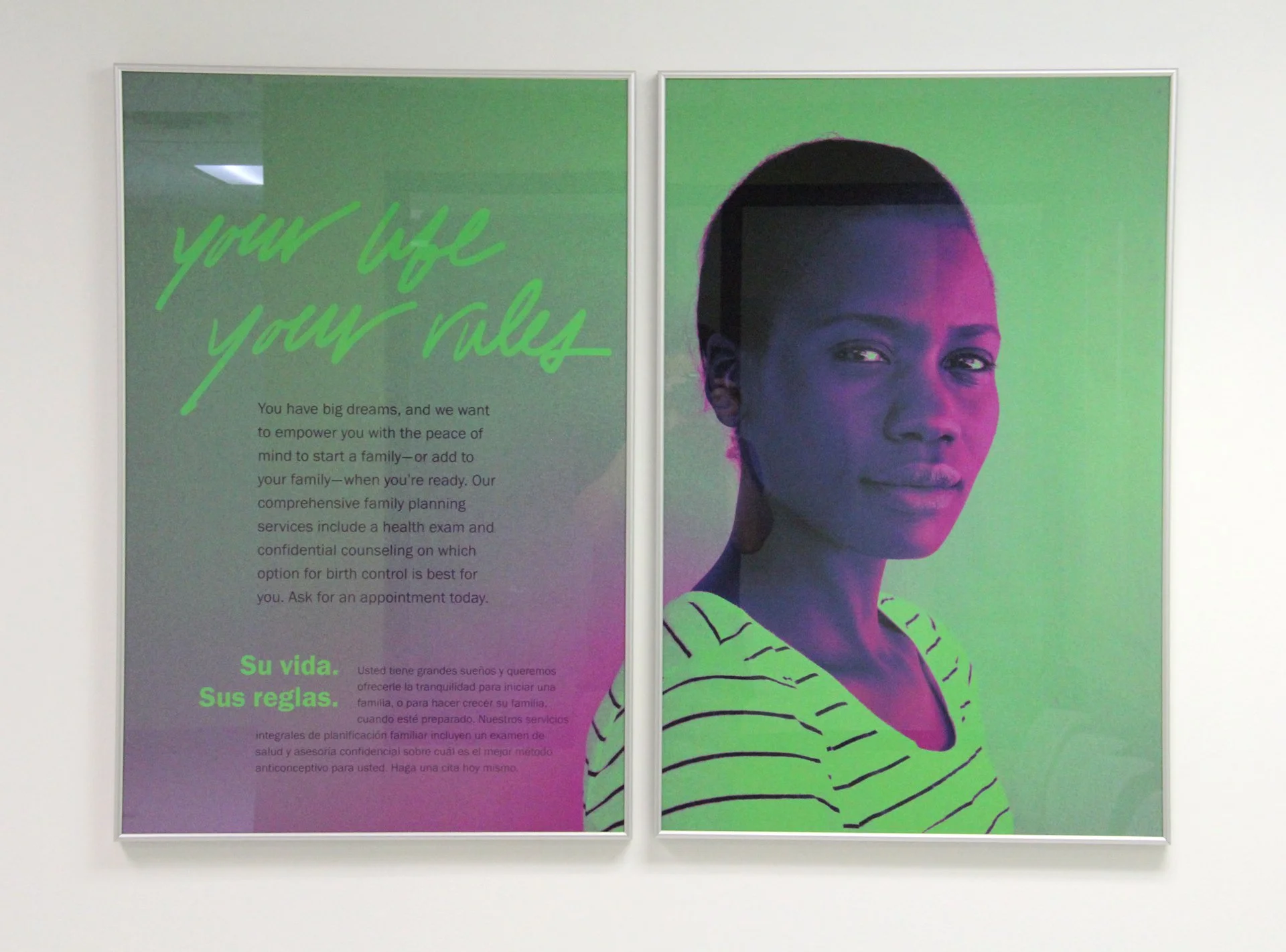
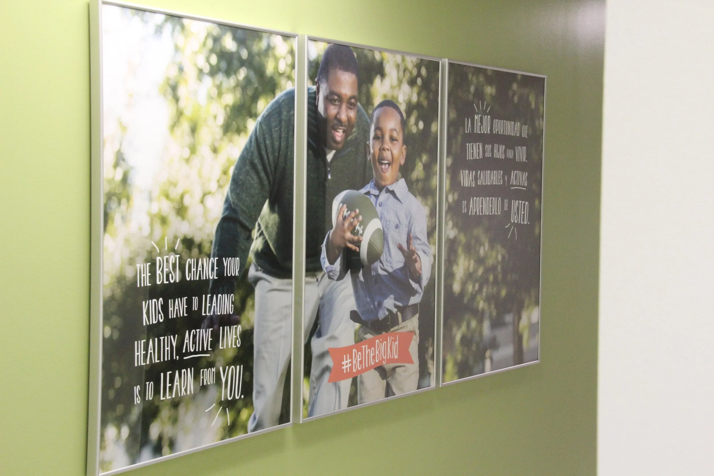
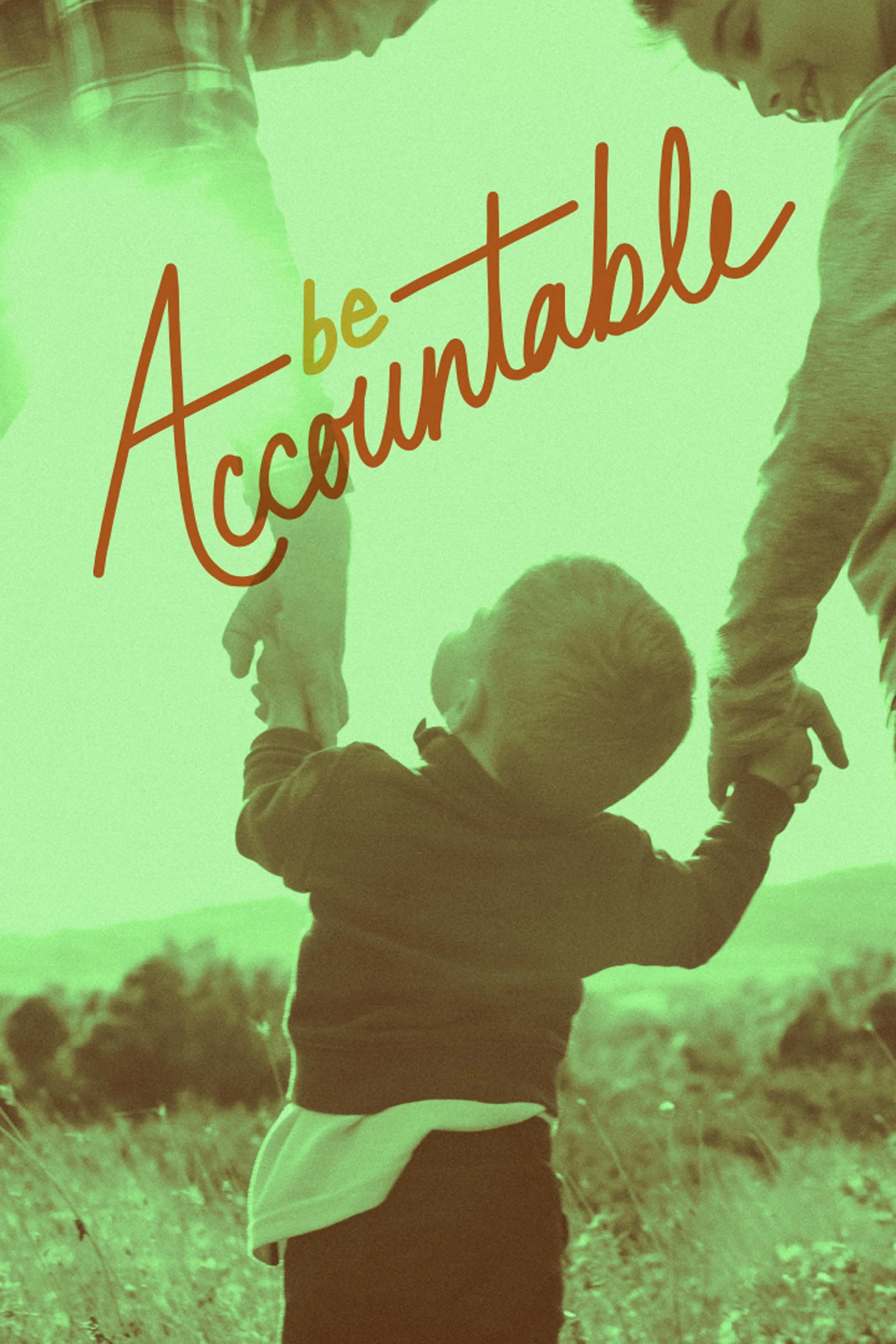
Service posters, messaging, and branded collateral
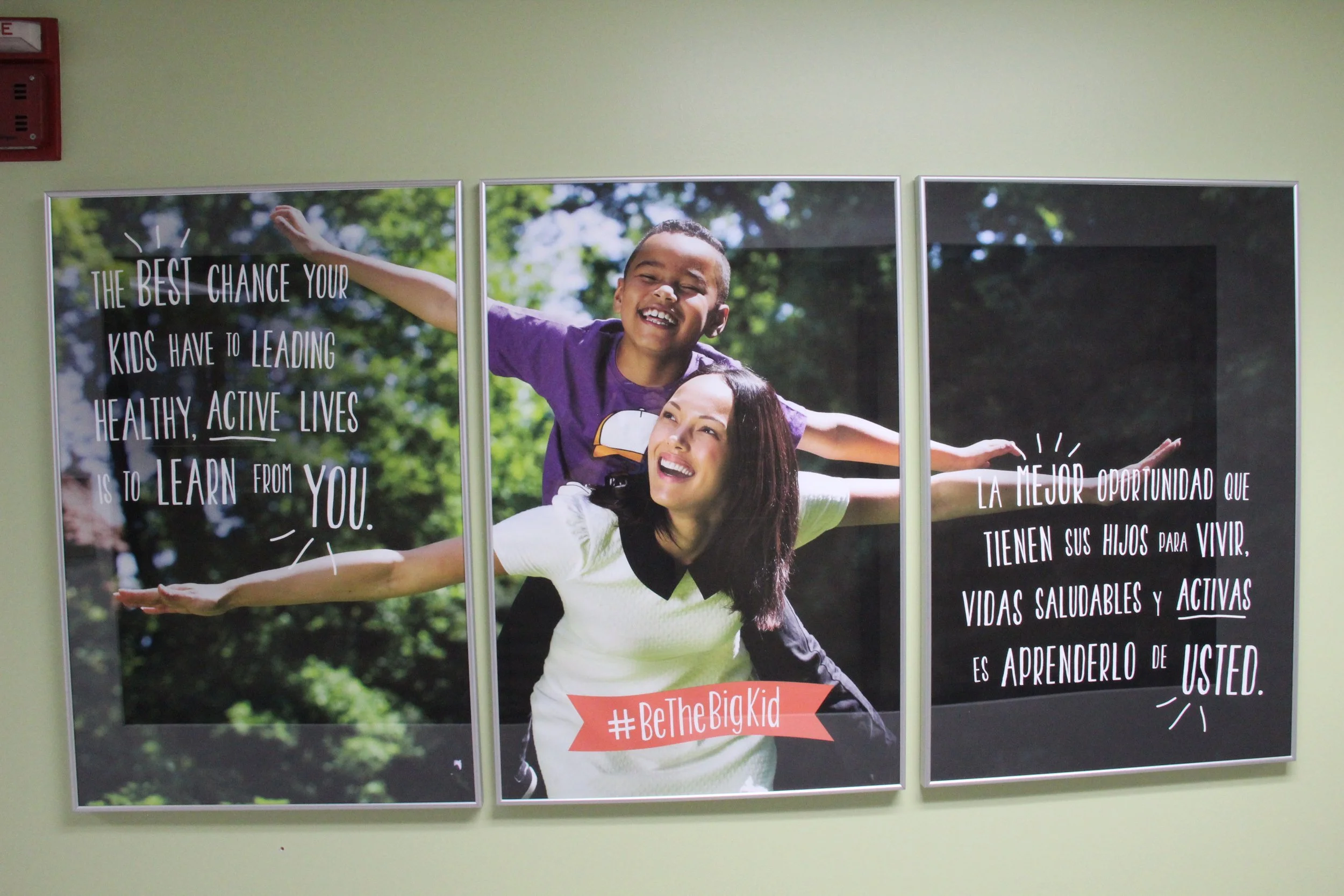
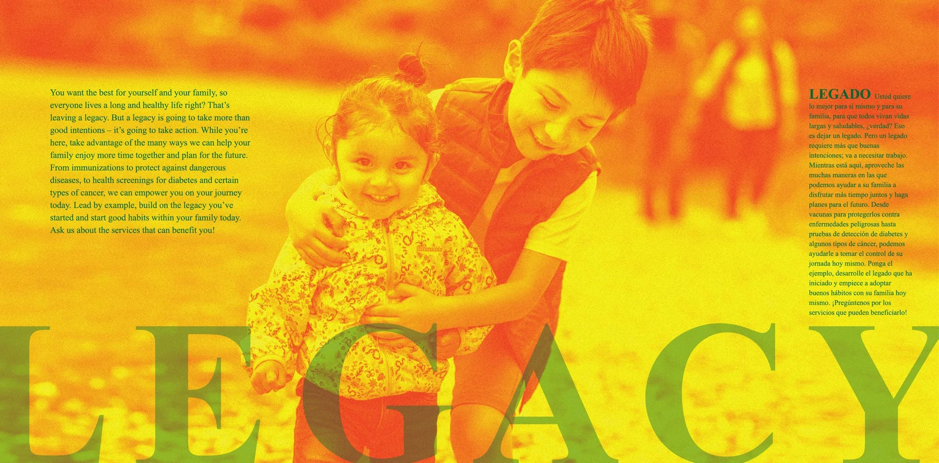
Beyond the murals, I developed a full suite of branded posters to cross-promote THD services throughout the building. Traditional public health communication often comes across as instructive, impersonal, or even judgmental. So, I focused on messaging that reflects empathy, relatability, and relevance to the client’s actual lived experience.
Each piece of collateral aimed to shift the message from “Here’s what you should be doing” to “We see you, we hear you, and we’re here to help.” This reframing was essential to build trust.


A strategy framework built around real people
To do this well, we needed more than good design. We needed insight. I used the Creative Strategy framework to map the range of client psychographics and demographics across the building’s various service areas. This helped us better understand what different clients might be going through, what matters to them, and how they might receive THD’s messages.
The resulting materials didn’t just list available services, they showed why those services mattered in the client’s life. The visual language was welcoming and human. The tone was warm, respectful, and clear. And every piece was built to feel like it belonged in the space.


