A flexible identity for a traveling STEM exhibit
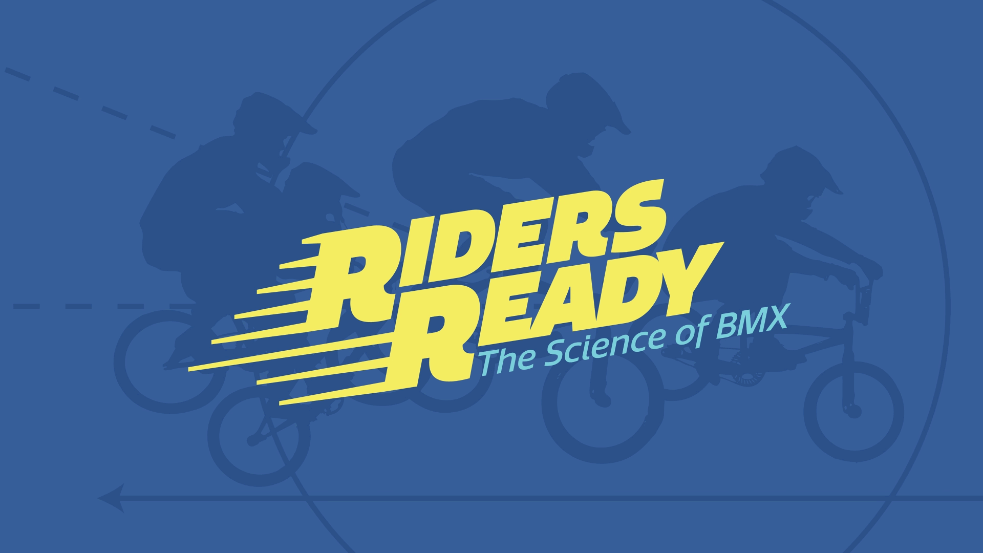
Riders Ready is Discovery Lab’s newest interactive exhibit, using the thrill and hands-on nature of BMX to introduce core STEM concepts. Designed to live at Discovery Lab for 1–3 years before traveling to museums across the country, the exhibit needed a bold, flexible identity system that could adapt throughout its lifecycle.
The brand system delivered on every front: it helped establish early legitimacy for fundraising, gave the exhibit a memorable and distinct visual presence, and provided clear, shareable assets for promotion and collaboration. With a strong identity in place, Riders Ready is positioned to engage and scale.


Before an exhibit can be built, it needs funding
At Discovery Lab, every exhibit begins with a “pitch packet”—an early-stage branding phase that brings the concept to life. This includes a distinctive visual identity applied across a donor pitch deck and a custom, tangible packet designed to leave a strong impression. The goal is to make the exhibit feel as official and real as possible, giving potential donors the clarity and confidence they need to move forward.


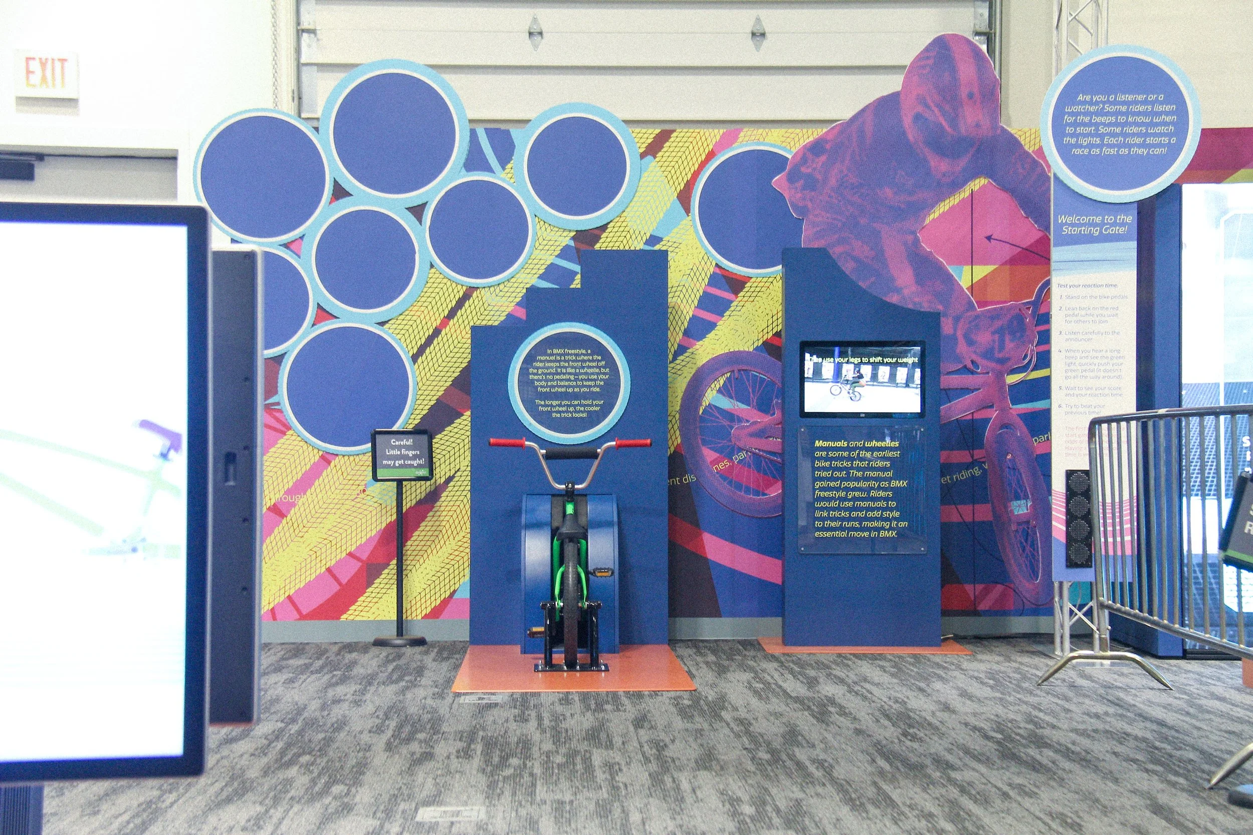
Transforming 2,000 square feet into an immersive BMX-themed exhibit
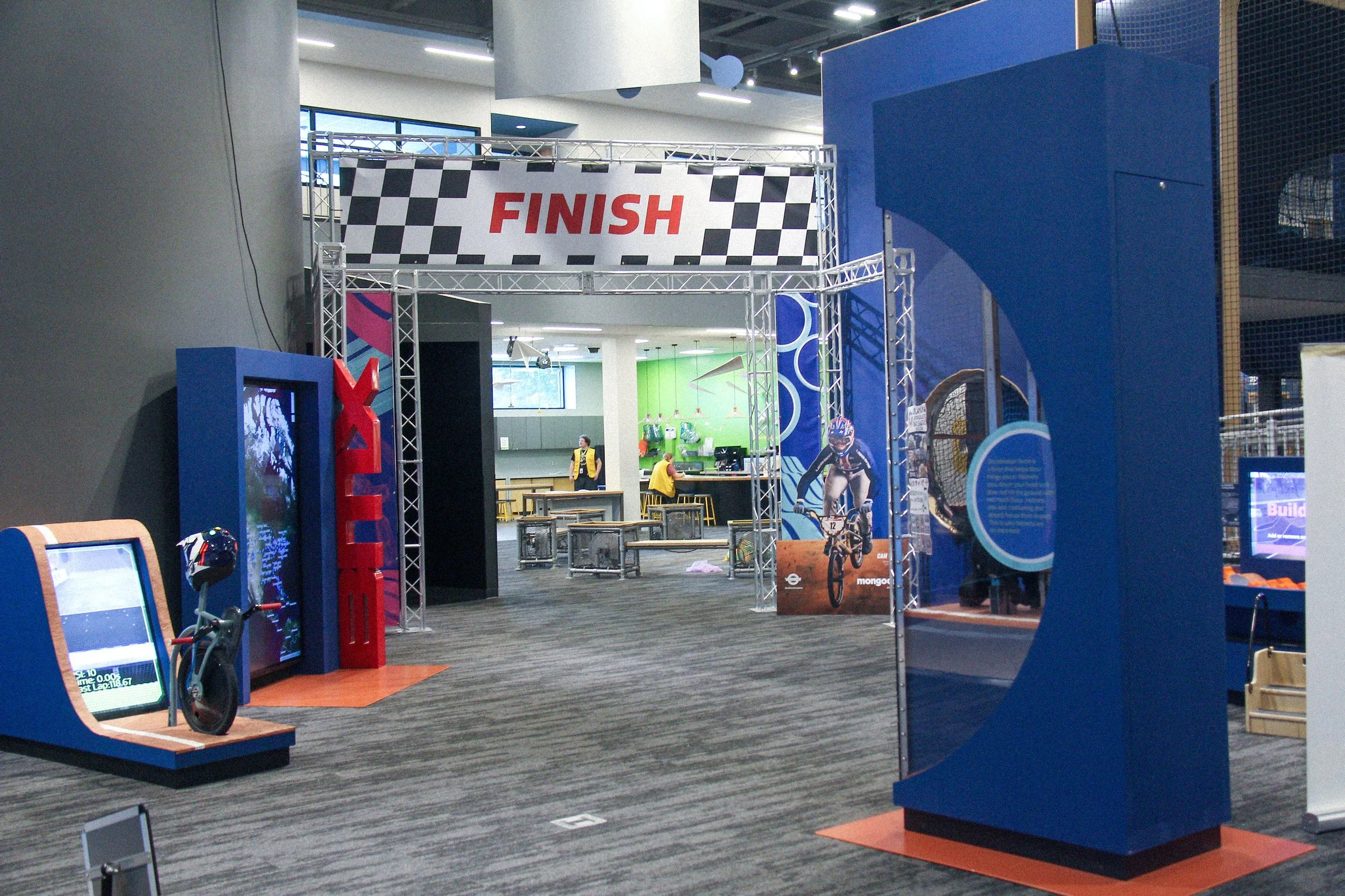
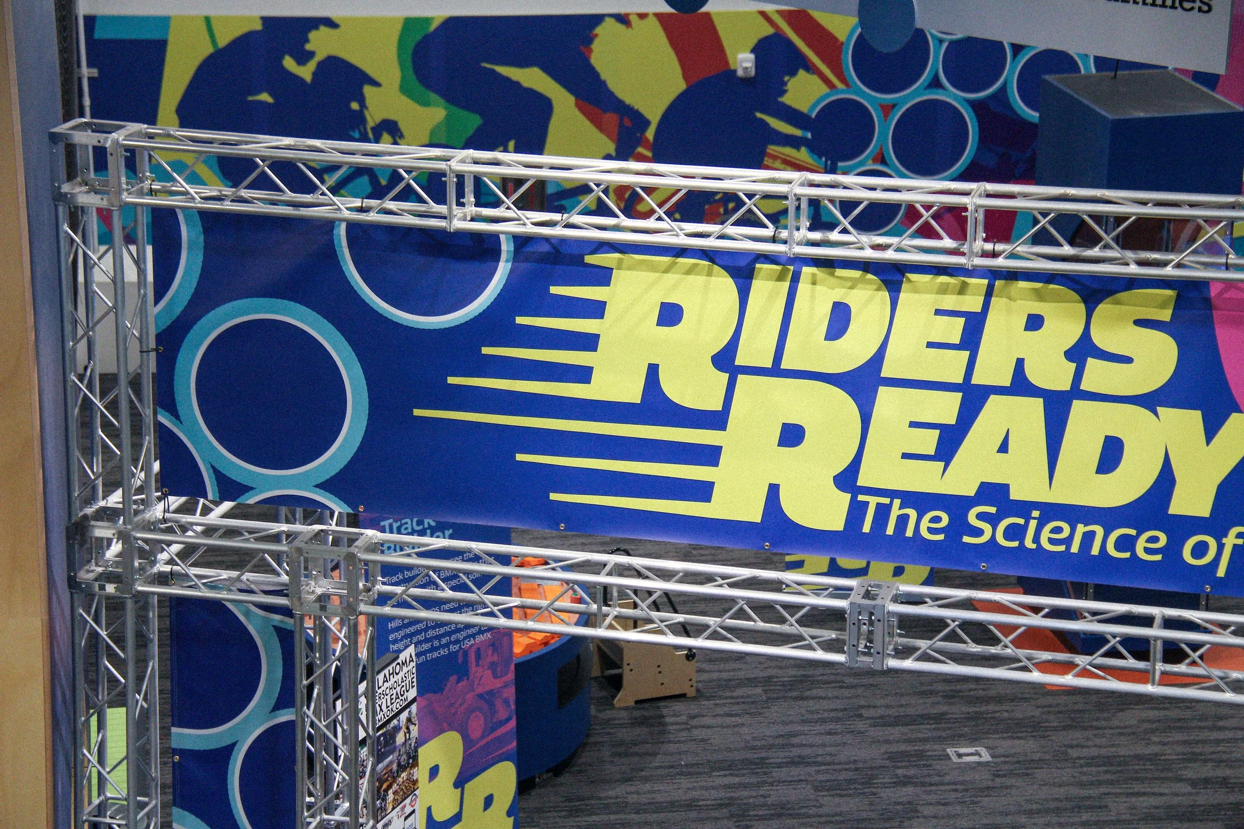
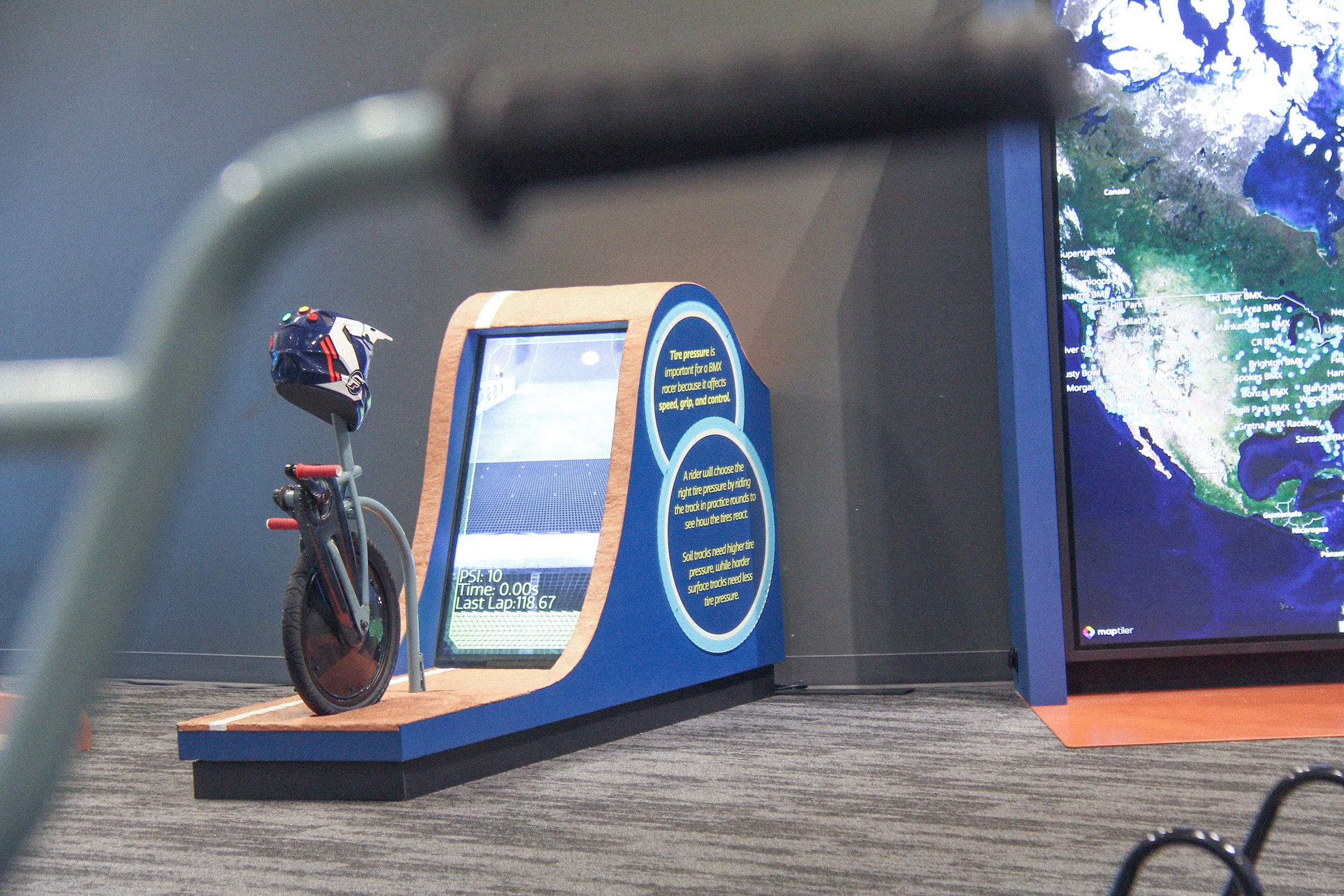
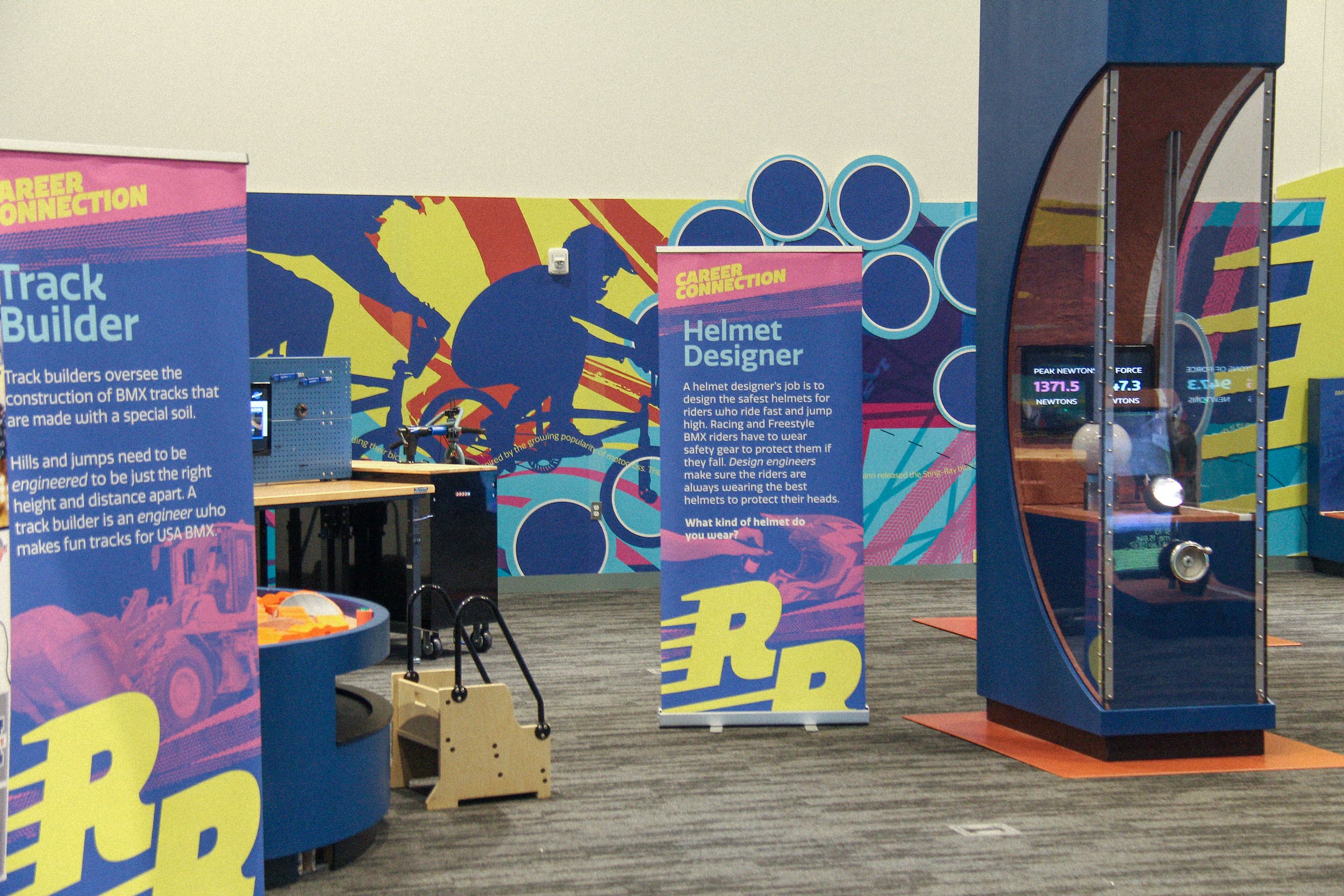
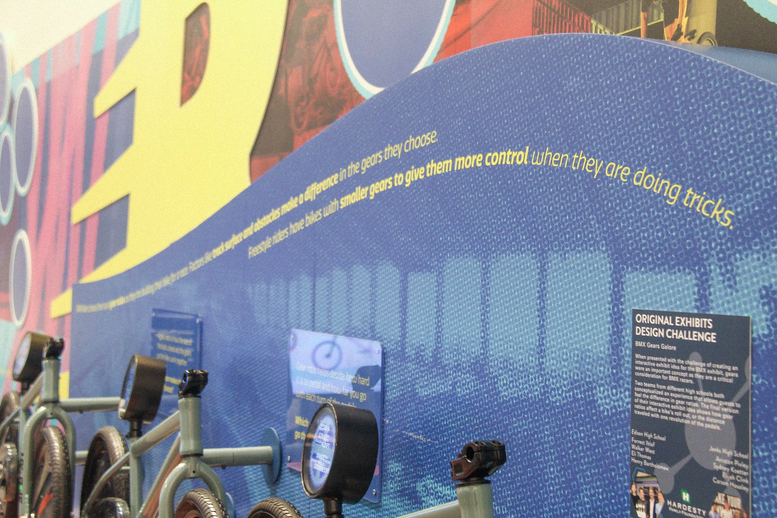
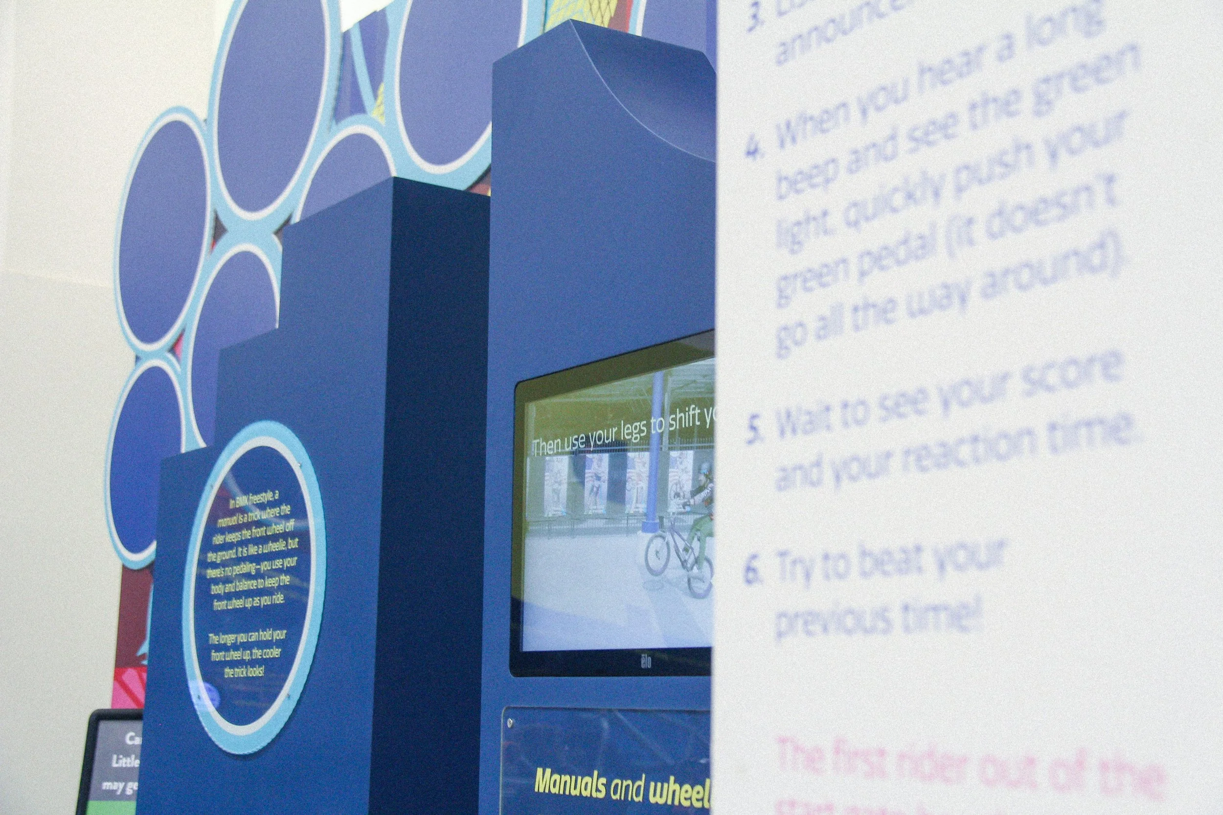
Once funding was secured, the concept moved into production. The initial pitch branding was expanded into a fully developed visual system. It was refined, clarified, and scaled to support every touchpoint within the space. From the monumental gateway to the instructional labels on each interactive, the identity was built to flex and adapt. Early brand guidelines were created so contractors could easily apply the system across UX and spatial elements.
One of the most striking brand moments is the exhibit’s entrance. Inspired by an idea from the Discovery Lab team, the gateway was modeled after a real BMX race starting gate. Trusses were built to hold overhead banners, mimicking authentic race-day infrastructure while serving a practical signage purpose. The result is bold, memorable, and rooted in the exhibit’s theme.
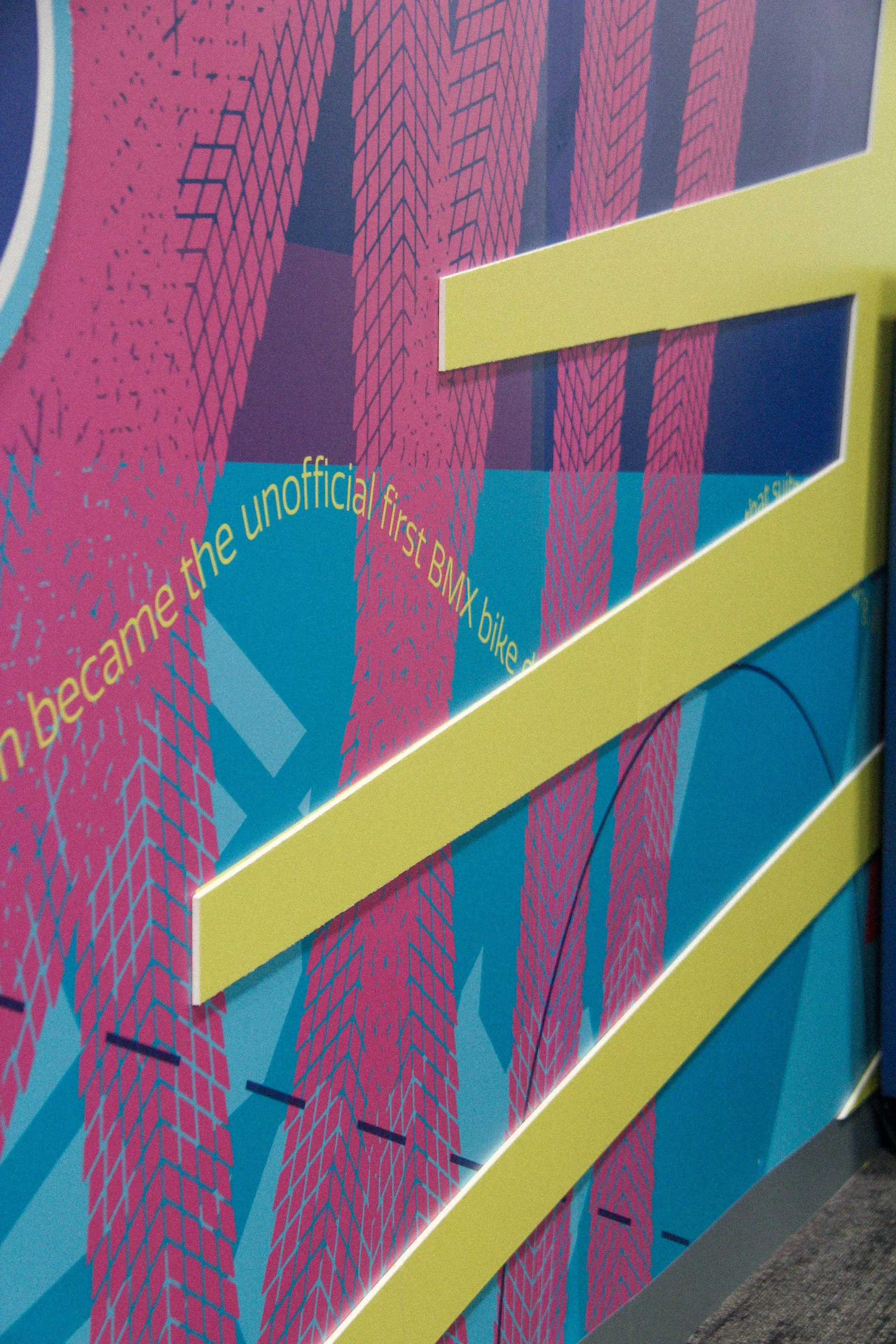
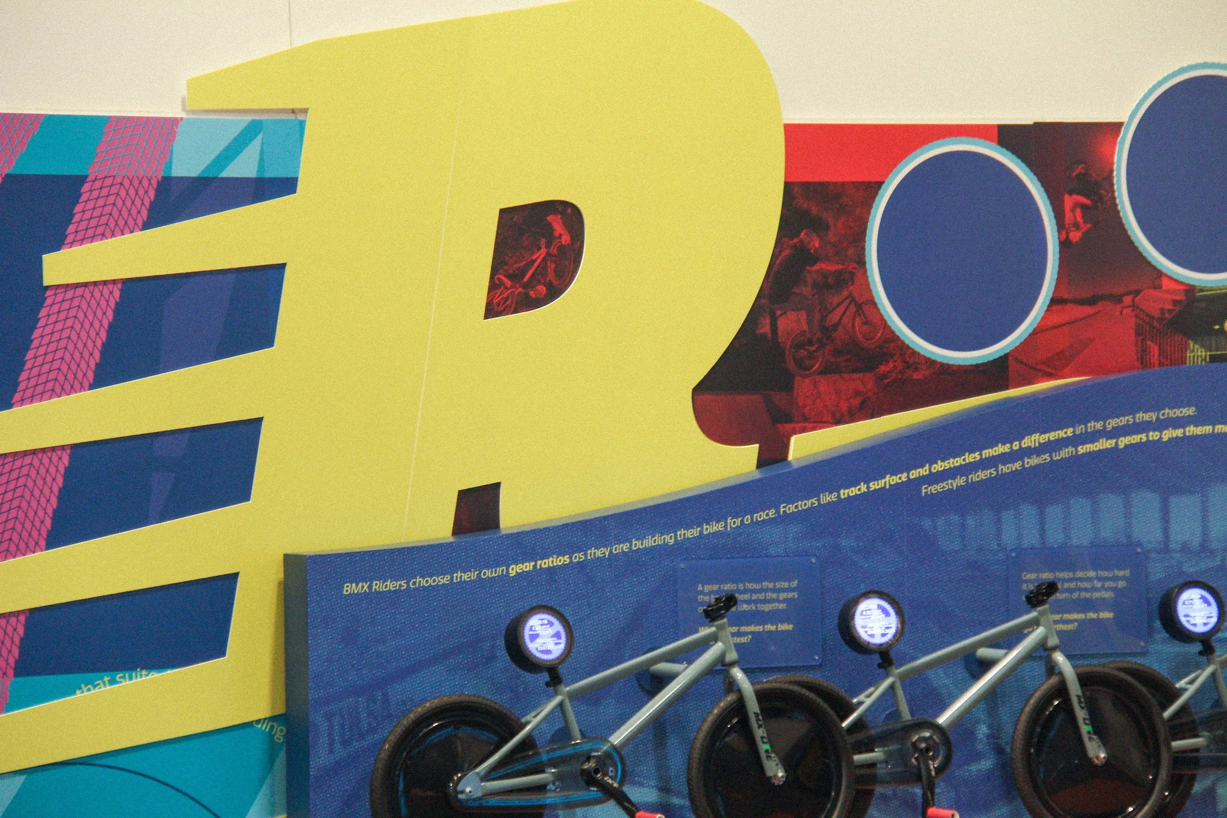
Inside, two large murals dominate the space. Designed with a maximalist approach, they blend BMX freestyle photography, hidden nods to BMX history, and layers of branded visual elements. The massive scale of the space allowed for a second, dimensional layer in the murals to break up flat walls and add depth and movement to the design.
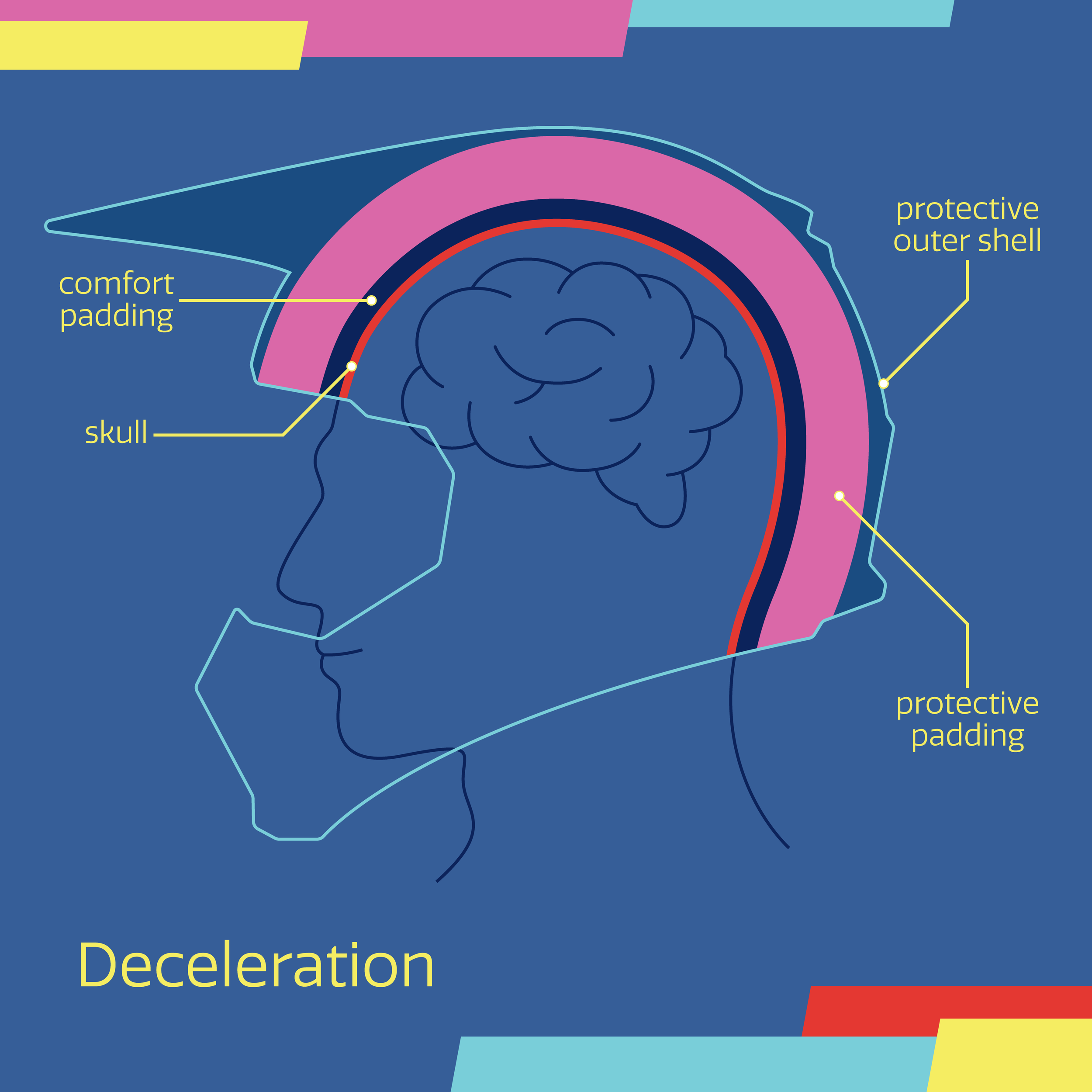
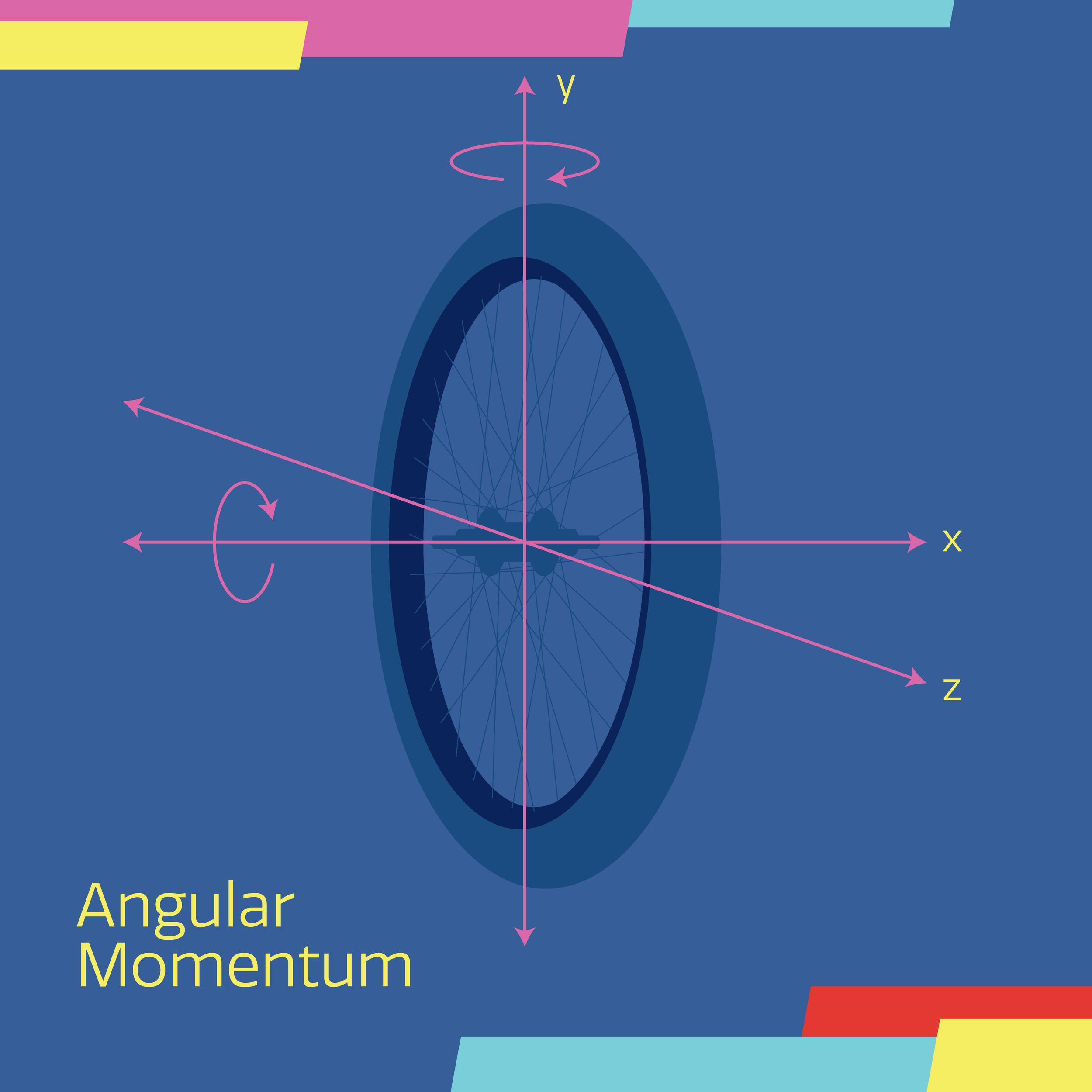
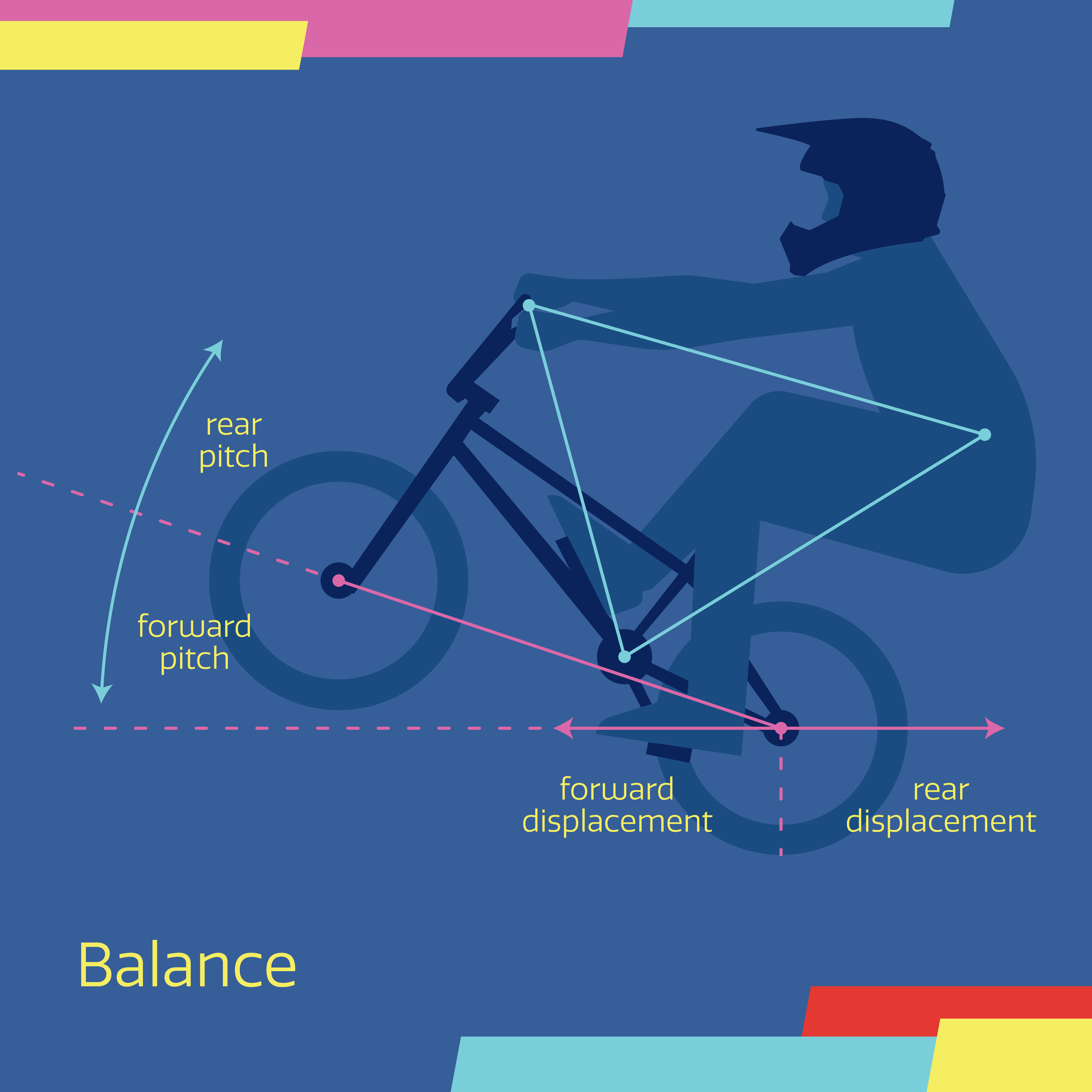
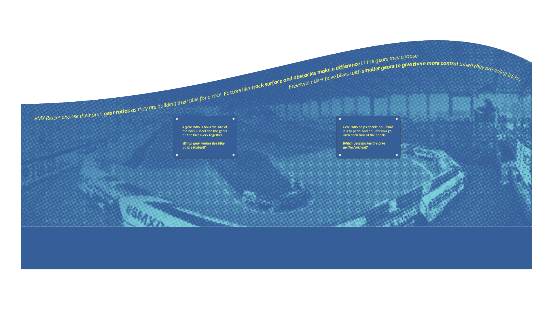
The exhibit’s typography system was designed to guide visitors through varying levels of engagement. Large-scale environmental copy serves group areas, while smaller explanatory copy supports focused, interactive moments that prompt curiosity and enhance understanding at each station.


Launch, promotion, and preparing to travel
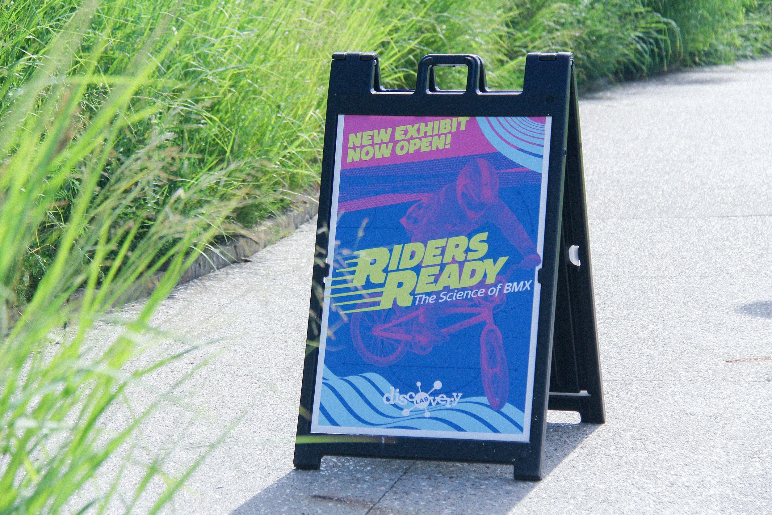
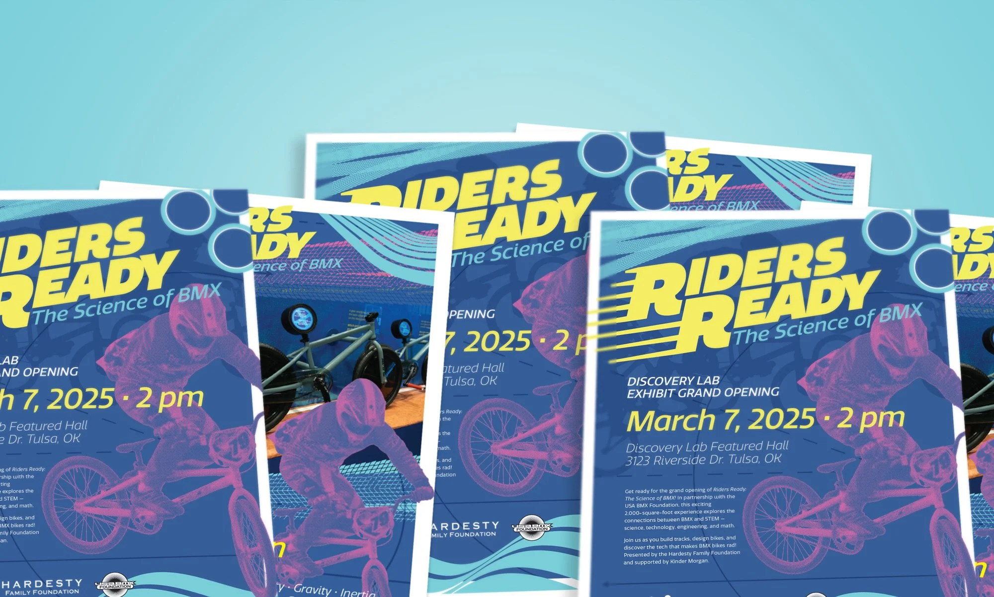
The final phase focused on marketing and visitor engagement. This included a full suite of promotional tools: social media graphics and templates, grand opening and rental flyers, on-site signage and animations, and contributions to the overall visitor experience.
Riders Ready made a strong debut, welcoming over 90,000 visitors in its first six months. The exhibit was also supported by multiple earned media features and collaborative social media posts.
To prepare for the exhibit’s future as a traveling installation, all brand and marketing assets were bundled into a comprehensive renter’s package. This toolkit includes ready-to-use graphics, templates, and promotional materials. Everything a host museum needs to successfully launch Riders Ready in a new region.