Building brands people remember
A strong brand identity signals clarity and confidence. Whether launching something new or evolving something established, identity design can emphasize legacy, establish trust, and differentiate from competitors. When done well, a brand identity becomes a distinctive visual thread. Something instantly recognizable that helps people remember, re-find, and reconnect with their past experiences with the brand.
A well-built brand system is a practical, usable toolkit. Designed for flexibility, it empowers teams to maintain consistency across signage, social media, merch, and more. It boosts internal alignment, gives teams something to rally around, and creates moments of delight that make communication more intuitive. In competitive markets, this kind of thoughtful distinction becomes a powerful asset, amplifying meaning, memory, and impact.


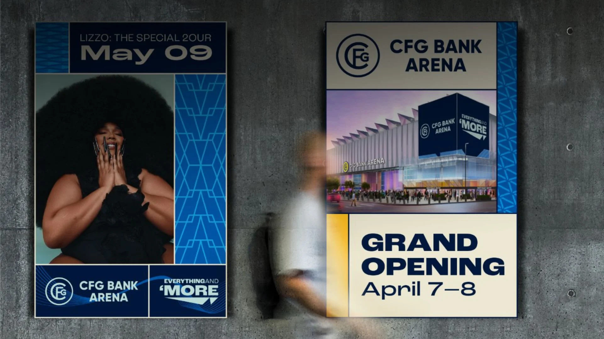
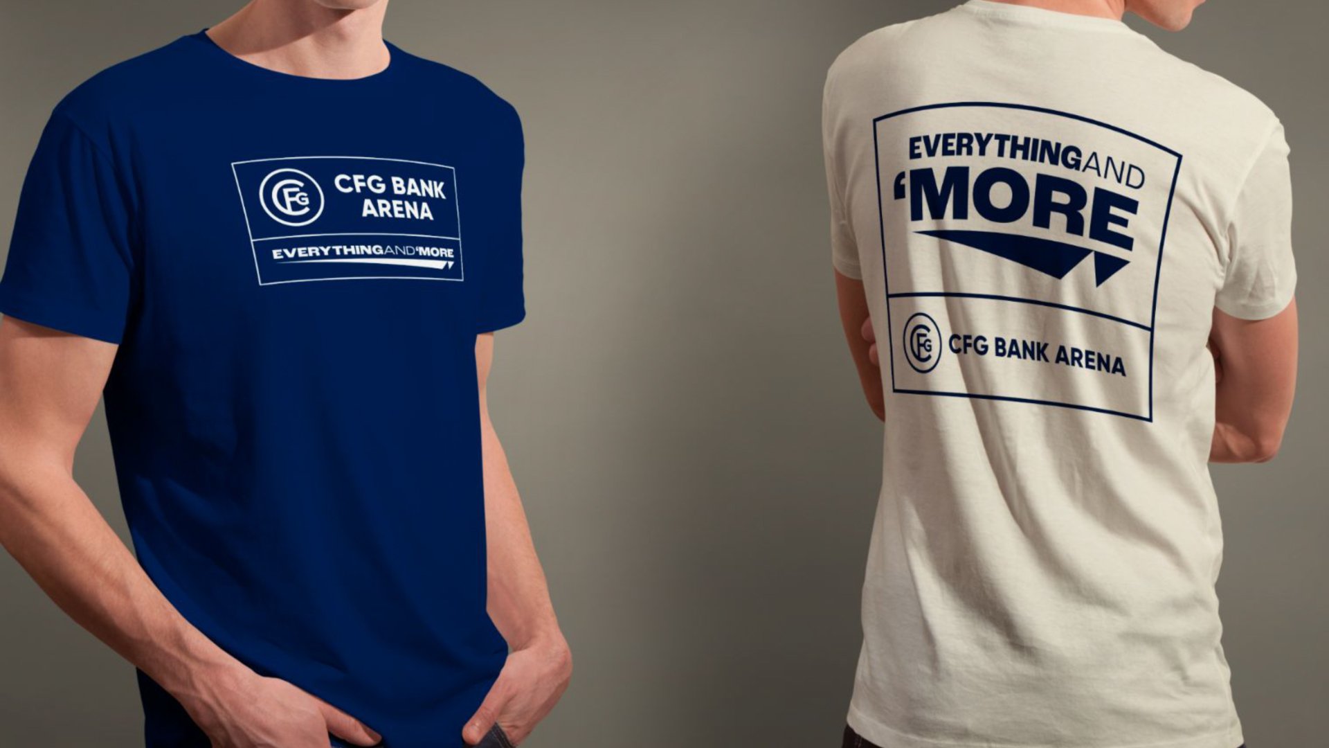
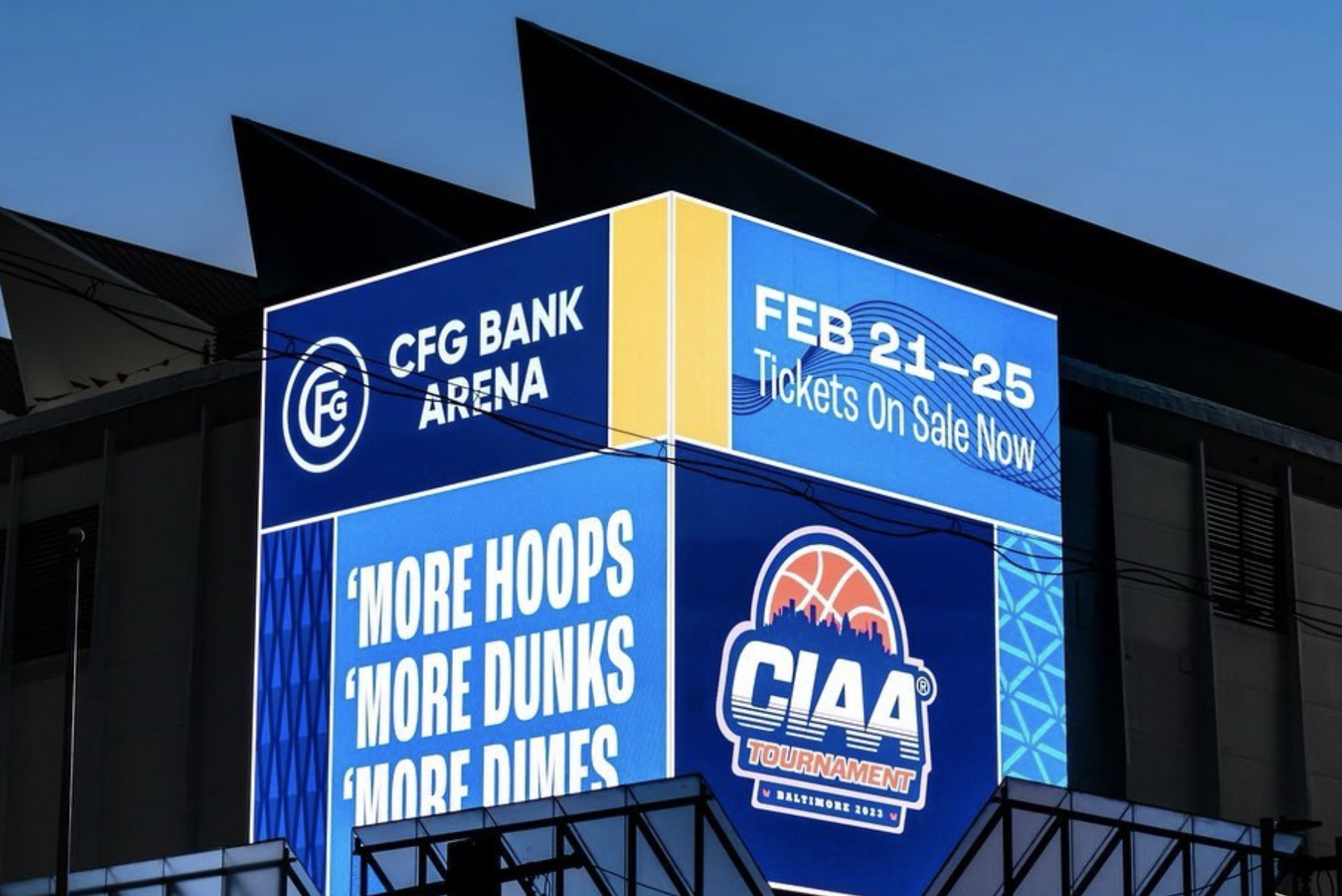
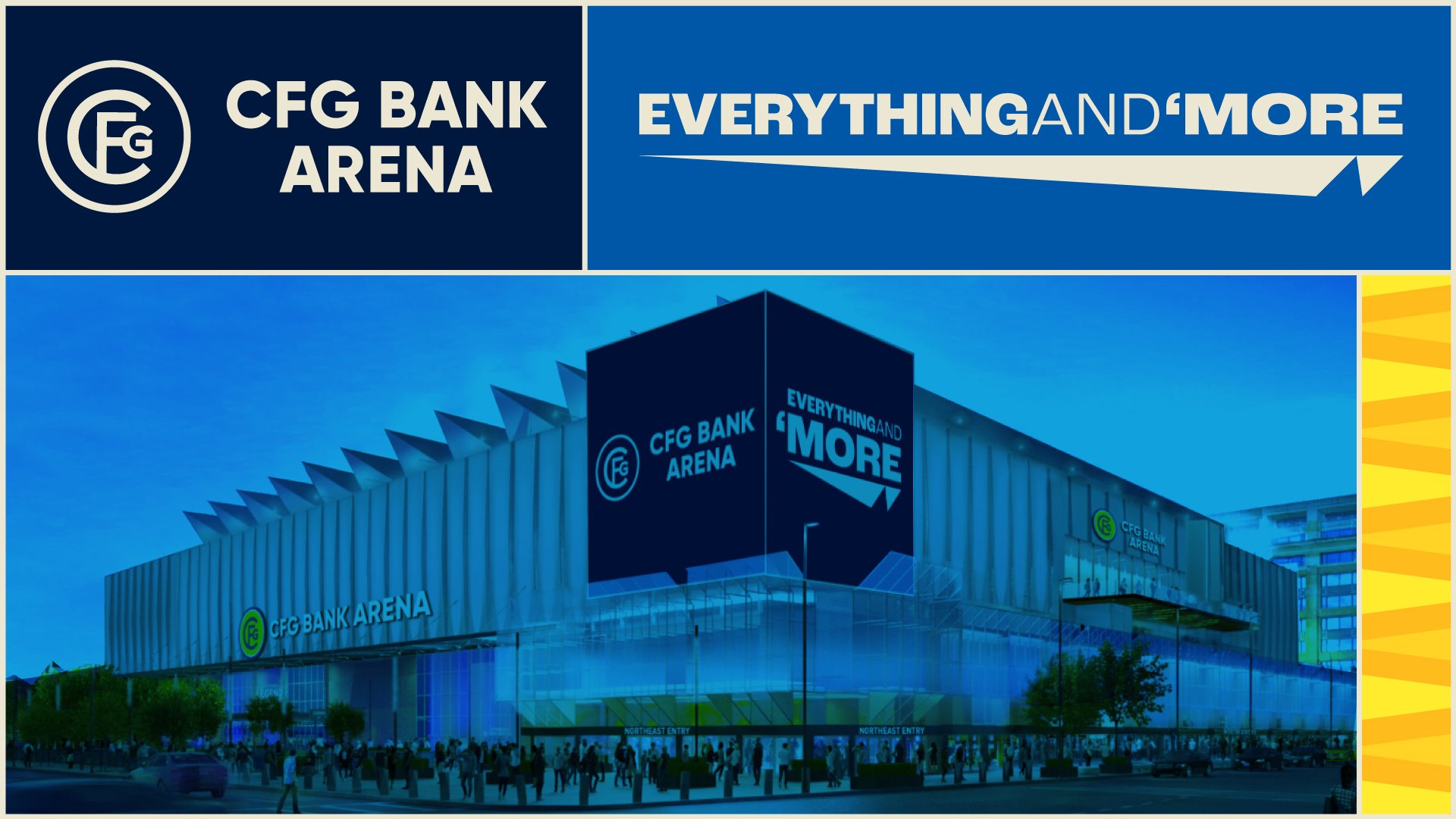
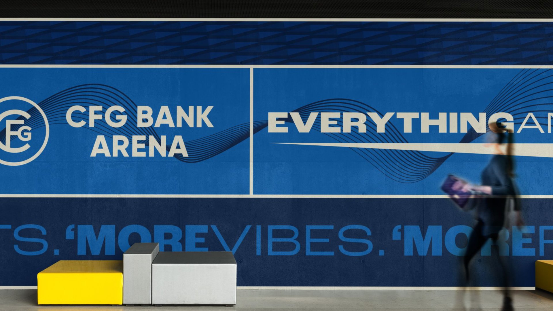
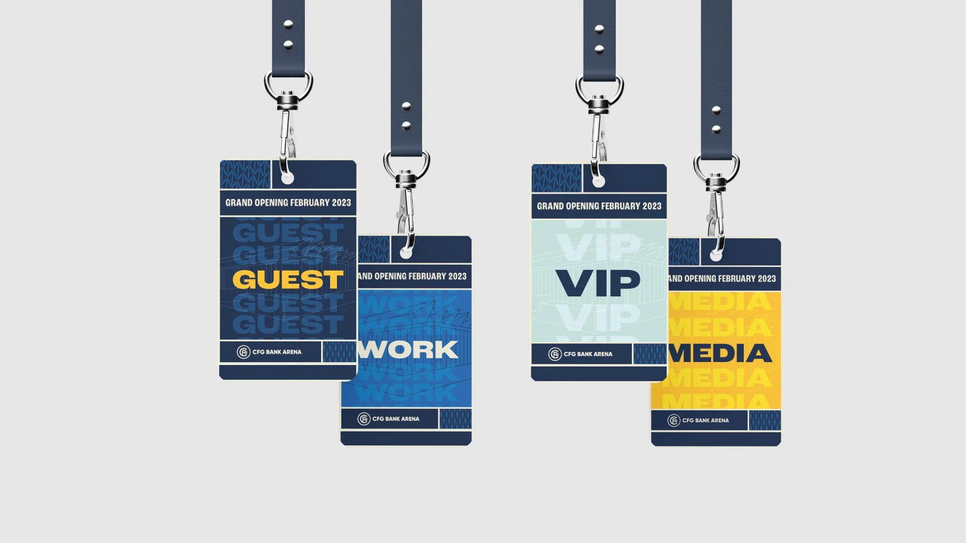
CFG Bank Arena: Reviving a legacy venue with a flexible campaign identity system
After a $200MM+ renovation and a change in management, Baltimore Arena was reborn as CFG Bank Arena. With a legacy that includes performances from icons like The Beatles and James Brown, the arena needed a promotional campaign to honor the arena’s history while signaling a bold new era.
The new campaign identity system took cues from the building’s architecture and its roots in music culture. Repeating triangular shapes from the iconic roof structure inspired graphic elements and brand patterns. A variable typeface with wide-ranging weights and widths echoed the energy of vintage concert posters while keeping the system cohesive. The flexible visual grid, inspired by the glass entry facade, was built to handle everything from wall wraps to social templates, keeping the identity strong across touchpoints.


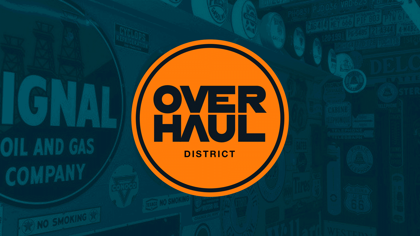
The Overhaul District: A nostalgic identity for a Route 66 revival
Located along a stretch of Route 66 in Oklahoma, a forgotten corridor of Sapulpa was set to be revitalized into a new, mixed-use neighborhood. The goal was to create a visual identity that embraced the area’s gritty past without glossing over it. Something bold, self-aware, and tied to the trucking culture that once defined it.
Inspired by vintage semi-truck graphics, road signs, and pit-stop Americana, the Overhaul identity leaned into the rebel charm. The final logo echoes a railroad crossing sign, while custom letterforms became the basis for a full signage-inspired graphic system ideal for merch and large-scale visuals. The system combined earthy Oklahoma tones with retro hues, all tied together with a bold, heritage typeface.
The result was a distinct, regionally grounded identity that could drive community pride, attract visitors, and support future expansion.


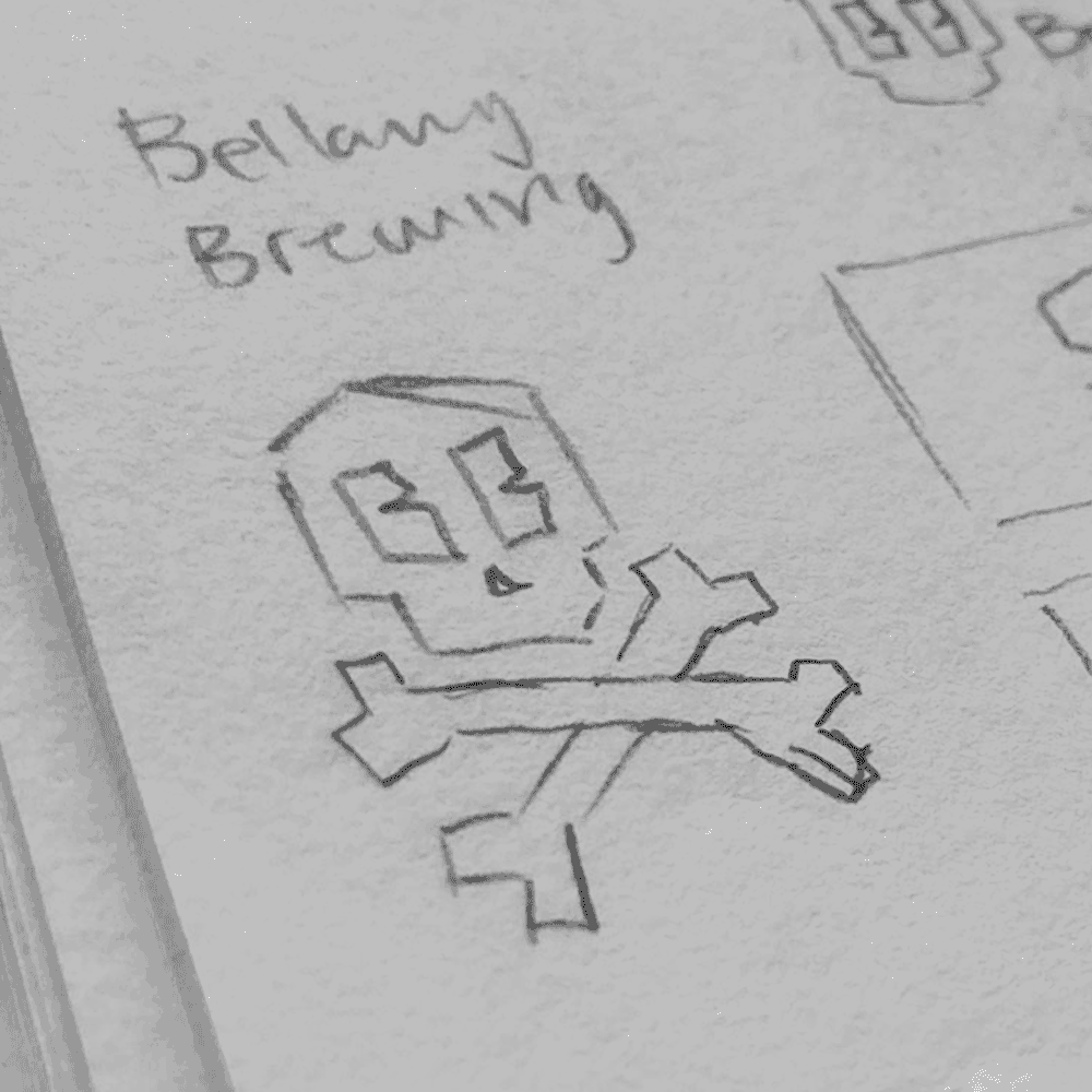
Bellamy Brewing: A bold identity for a brewery that doesn’t exist…yet
Bellamy Brewing is the dream of an aspiring Oklahoma brewer, inspired by the legacy of pirate Samuel Bellamy. Still in its pre-launch phase, the project needed a brand that could turn ambition into something tangible, marketable, and distinct.
The resulting identity system blends modern design with vintage pirate symbolism. A striking black flag, custom type, and skull-and-bones logo (complete with cartoon-style B-shaped eyes) form a visual language full of personality and intent. Supporting graphics reinforce the brand’s playfulness, creating a consistent look that’s both expressive and timeless.
Even without a finished product, Bellamy Brewing now feels real. The branding does the heavy lifting of helping people believe in the dream.


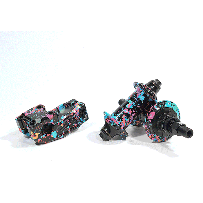
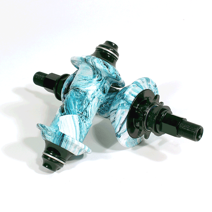
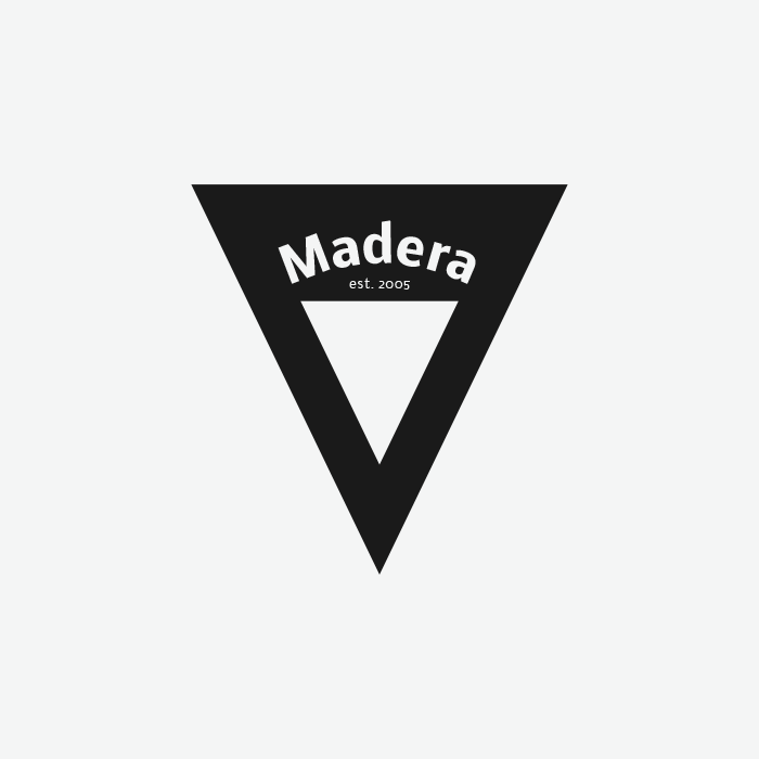
Madera: A focused rebrand for a respected BMX components brand
Madera is a niche BMX brand producing high-quality, American-made bike components. Despite selling products in over 100 countries, the brand lacked a cohesive identity that reflected its credibility within BMX. The rebrand set out to clarify Madera’s positioning, streamline its visuals, and reinforce its dedication to core riders and timeless craftsmanship.
The new identity draws from the brand’s most iconic physical detail: the 48-spline crank spindle. That feature informed a custom “M” icon, which pairs with a minimalist wordmark that emphasizes “MADE,” a nod to both the craftsmanship behind the products and the brand’s Profile Racing lineage. The visual system balances a utilitarian black-and-white palette with seasonal product colors, creating a flexible yet grounded brand language.
With a clearly defined mission, personality, and design system, Madera now has a consistent and credible brand presence across all touchpoints, from packaging to social to apparel. The updated identity strengthened loyalty among existing fans, improved merch performance, and empowered the team with a brand they’re proud to represent.


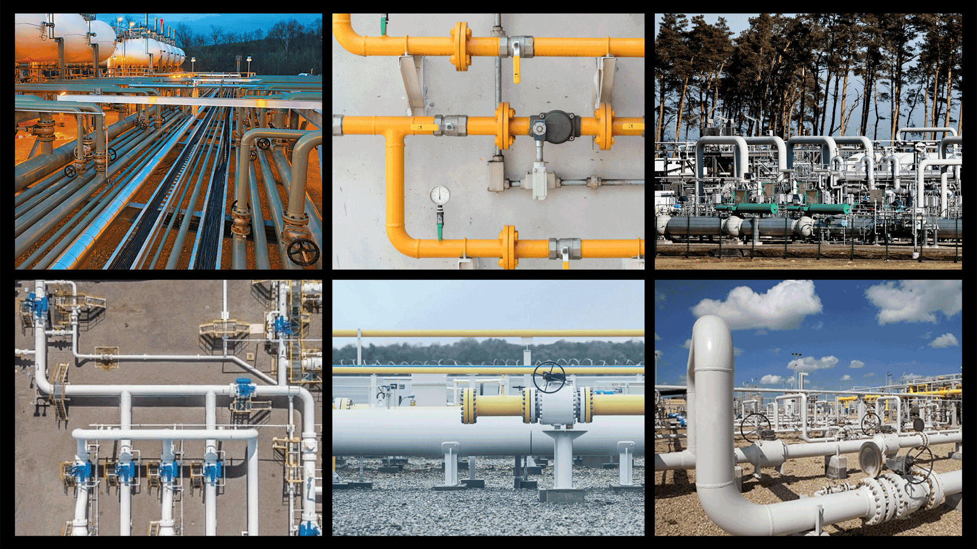
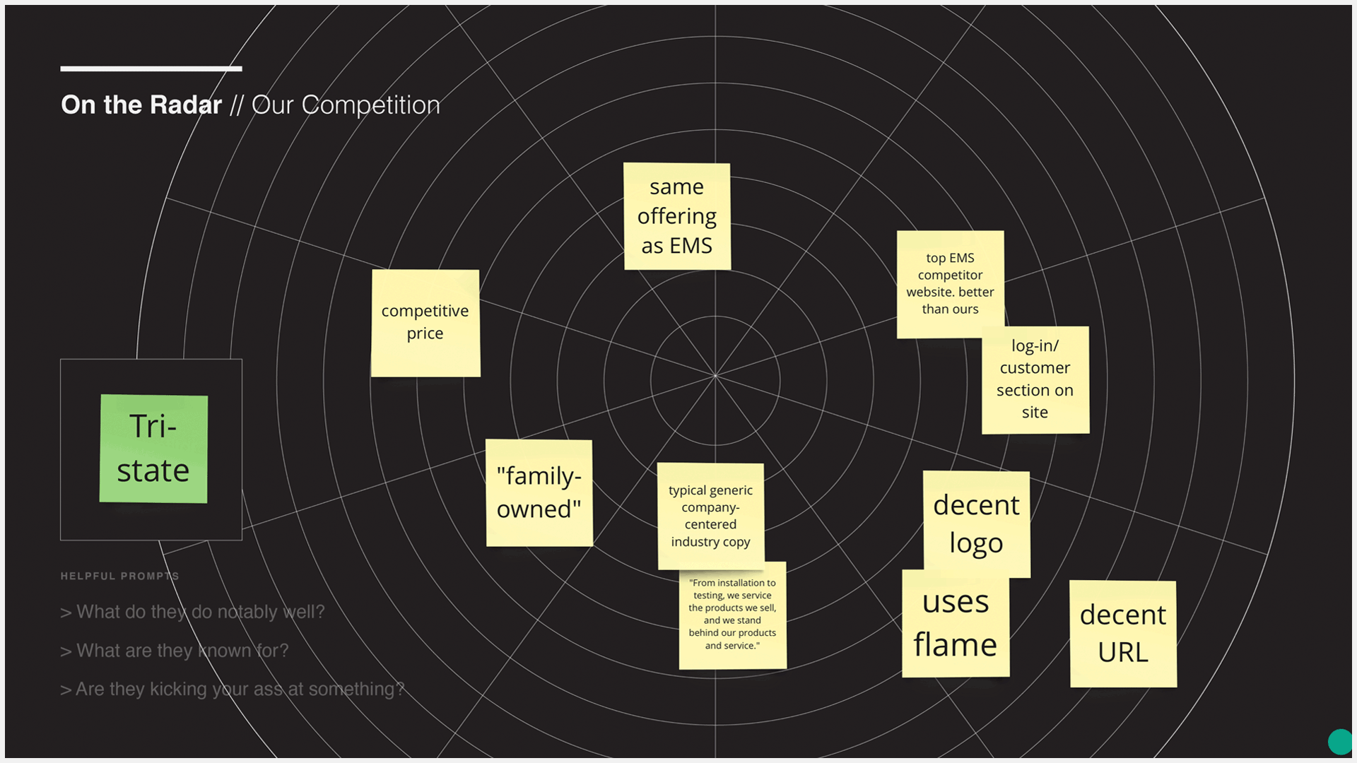
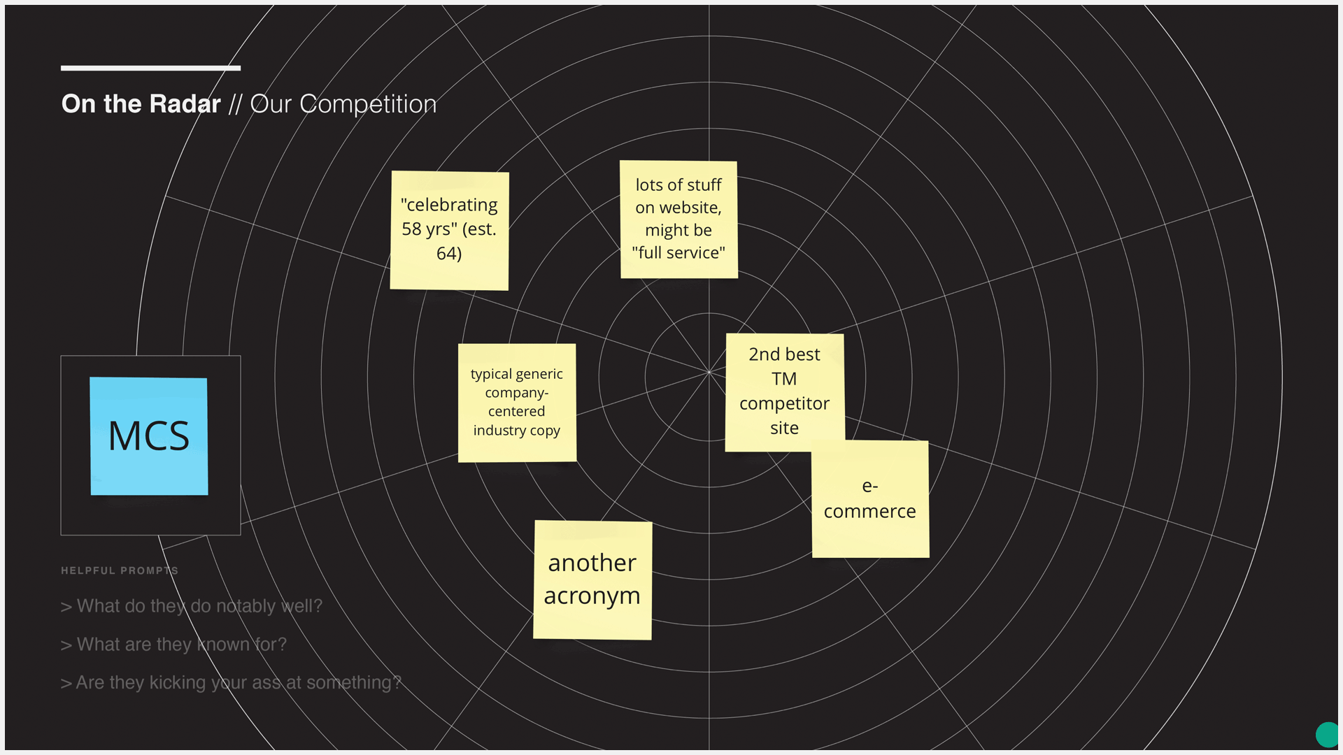
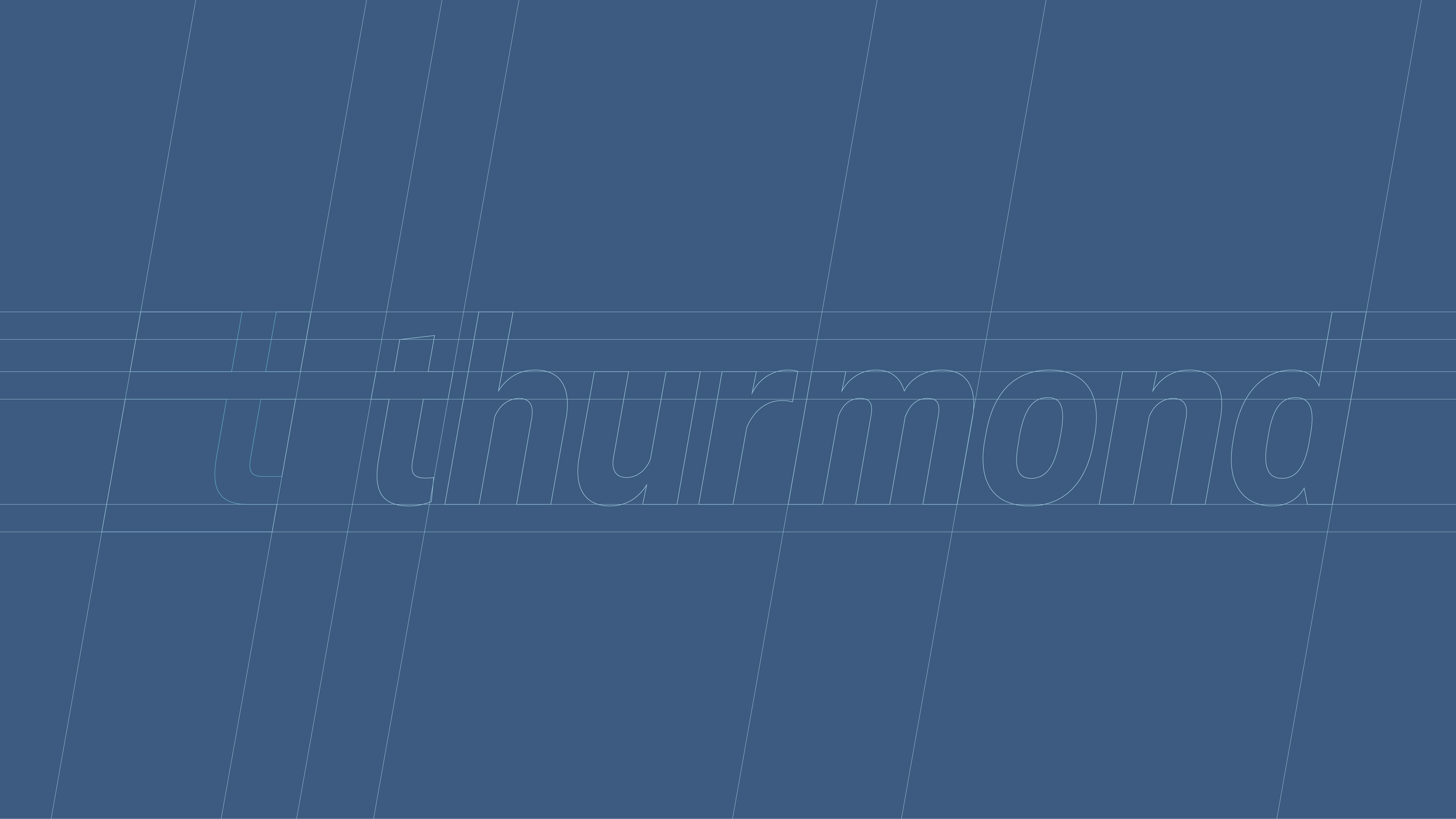
Thurmond: A legacy built to last
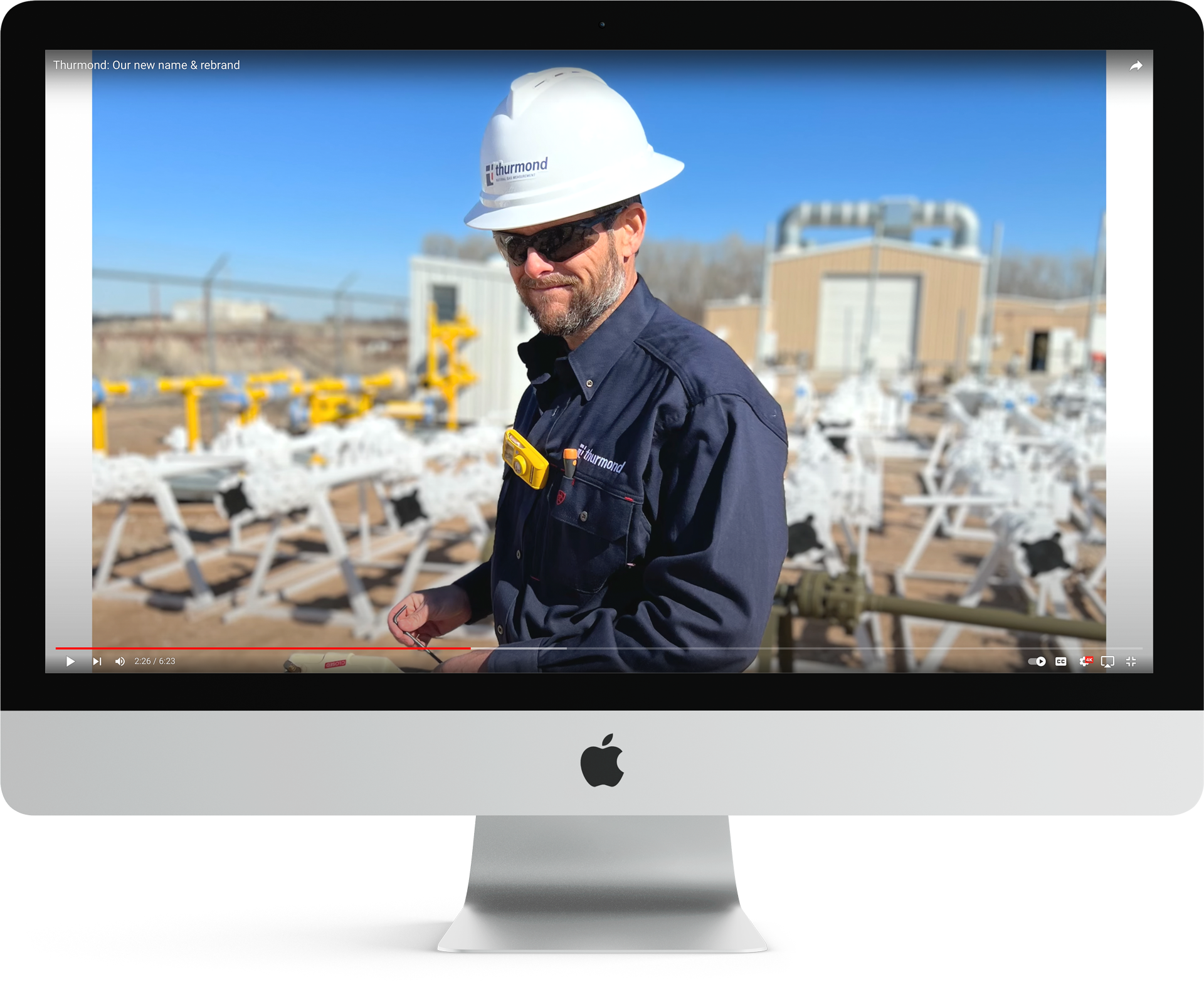
Two longstanding sister companies prepared to merge under the name Thurmond. They needed a cohesive identity that honored their shared legacy while positioning them for the future. Through competitive research and visual exploration, a brand mark was developed to reflect 77 years of industry expertise without feeling overly corporate.
The new identity avoids industry clichés and offers a distinctive, flexible suite of logos built around a custom “T” icon inspired by abstracted pipeline forms. The lowercase wordmark keeps the tone approachable, and an 11-page usage guide ensures consistency across every application, from hard hats to business cards.


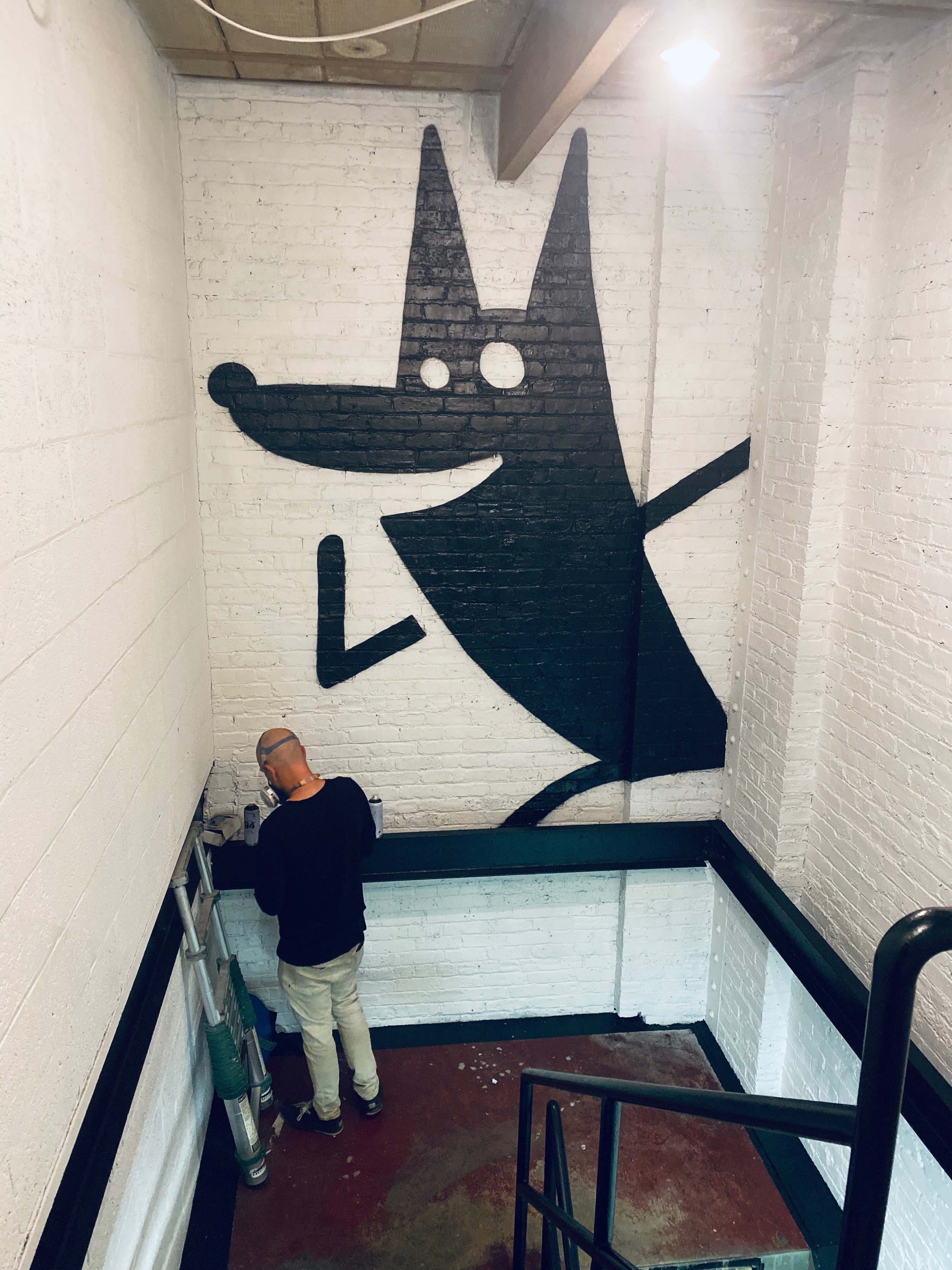
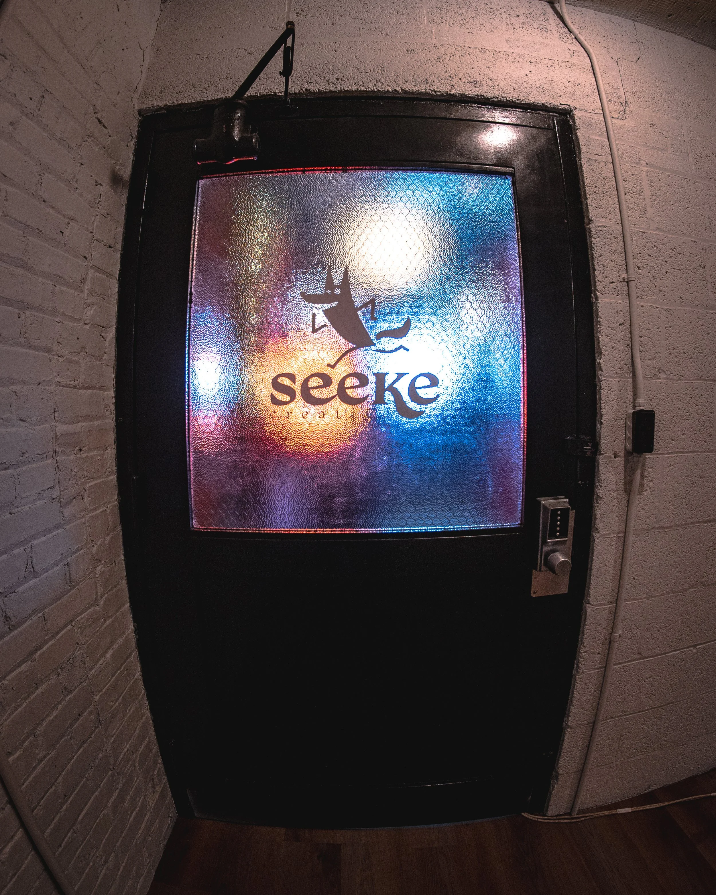
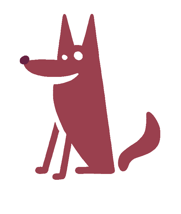
Seeke Creative: Personality in motion
Seeke Creative, a small content studio in Milwaukee, needed a visual identity that matched their playful energy and hands-on approach. The brand system centers around a charming custom mascot (a simple, expressive wolf) paired with a custom wordmark that balances classic and modern elements.
With a full pack of logos, mascot poses, patterns, and Instagram-ready graphics, the identity gives the team flexibility to bring personality into everything from merch to motion content.