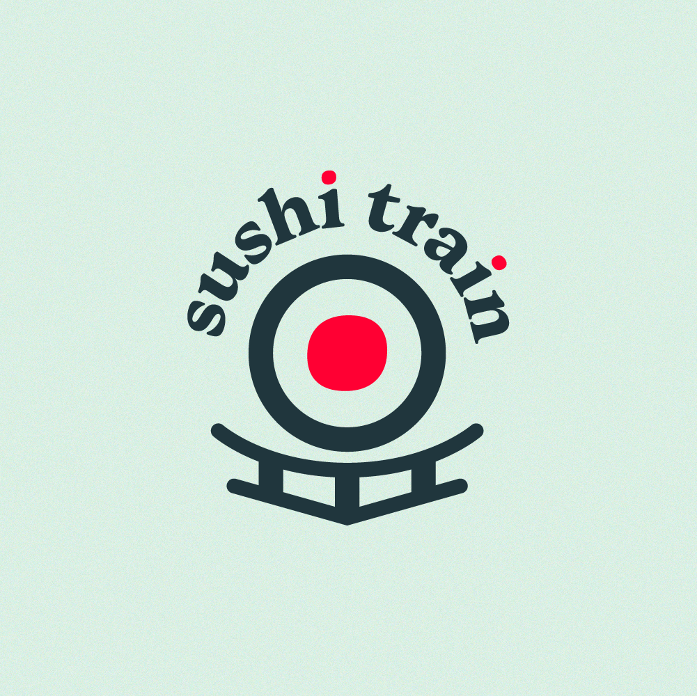
So, it’s best to keep things simple and try to not do too many tricks. Typically, I try to keep a logo to one single visual trick. But this project was for fun, so we have a lot of tricks going on here.
Japanese flag for the filling, which is also an enlarged dot of the i (using shared DNA from the type)
Train tracks and lines inspired from Japanese shrines
All together it's like you’re looking face to face with an oncoming train. Made of sushi. Yum
My intent was to make it feel relevant but unexpected: no cliché kanji, no brush strokes, etc. Like Harvard Liquor from my previous post, Sushi Train has one of those so-careless-it's-charming signs. It uses Cooper black, which is a pretty solid choice, but it's set pretty bad.
For my logo redo, I wanted to use a typeface that preserved some of the charm from the original sign with Cooper. I found Monarcha bold, and I think it does a pretty good job.
Agree or disagree? Hit me up and let’s talk about it.


